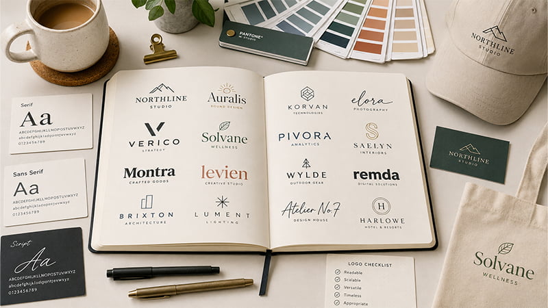
Finding cool fonts for logos is easy. Choosing one that works across websites, packaging, apparel, and promotional products takes more thought. A typeface can look sharp on screen but lose clarity when printed small, embroidered, or engraved. This guide compares 60 logo fonts and explains how to choose, test, and apply them across real-world brand applications.
What Makes a Good Font for a Logo?
A good logo font needs more than visual appeal. It should fit the brand personality, remain easy to recognize, work across different sizes, and reproduce clearly in real applications.
A typeface that looks polished in a large digital mockup may behave differently when reduced, embroidered, printed, engraved, or debossed. Use these four criteria as a quick filter before comparing individual fonts.
For a broader look at wordmarks, lettermarks, combination marks, and other logo structures, see TOMAS Crafts’ guide to the main types of logos.
The Main Types of Fonts Used in Logos
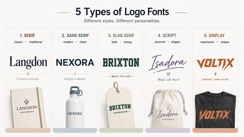
Understanding the main types of fonts makes it easier to narrow hundreds of choices into styles that fit your brand.
| Font Type | Typical Feel | Common Brand Direction | Main Watch-Out |
|---|---|---|---|
| Serif | Classic, refined | Hospitality, finance, premium brands | Fine serif details |
| Sans Serif | Clean, modern | Technology, corporate, sports | Very light weights |
| Slab Serif | Bold, sturdy | Outdoor, food, industrial | Can feel dense when reduced |
| Script & Handwritten | Personal, expressive | Beauty, hospitality, craft | Thin joins and loops |
| Display & Decorative | Distinctive, creative | Entertainment, lifestyle | Small-size readability |
Serif Fonts
Serif fonts use small finishing strokes around the main letterforms. They can feel traditional, editorial, elegant, or formal depending on their construction. A Garamond-style serif, for example, creates a very different impression from a high-contrast Bodoni-style design.
Sans Serif Fonts
A sans serif font removes those finishing strokes and usually creates cleaner shapes. Geometric styles can feel precise, neo-grotesque typefaces more neutral, and humanist sans serifs warmer and more approachable.
Slab Serif Fonts
Slab serifs use heavier, more substantial serif forms. They can feel sturdy, energetic, collegiate, industrial, or retro. Their strong structure creates visual impact, although very heavy letters can become crowded when reproduced small.
Script and Handwritten Fonts
Script fonts draw from handwriting, brush lettering, signatures, or calligraphy. They can feel personal, crafted, elegant, or casual, but small loops, thin joins, and flourishes deserve extra testing at reduced sizes.
Display and Decorative Fonts
Display fonts use distinctive shapes and stronger personalities. They can work particularly well for short wordmarks and expressive brands, but unusual letterforms often lose readability faster when scaled down.
How to Choose the Right Logo Font
A list of the best fonts for logos is useful only if you know how to narrow the options.
Match the Font to Your Brand Personality and Market
Start with the brand instead of the font library.
What should the business feel like?
- modern;
- dependable;
- premium;
- playful;
- technical;
- energetic;
- approachable;
- handcrafted.
Then look at typography used by other companies in your category.
Industry conventions can help customers recognize the type of business, but following them too closely can make every logo look alike. A font can fit your industry and still be the wrong choice if it makes your brand indistinguishable from competitors.
The goal is not to find one universally perfect logo font. It is to choose a typeface that supports your brand while leaving room for visual distinction.
Consider the Length and Shape of Your Brand Name
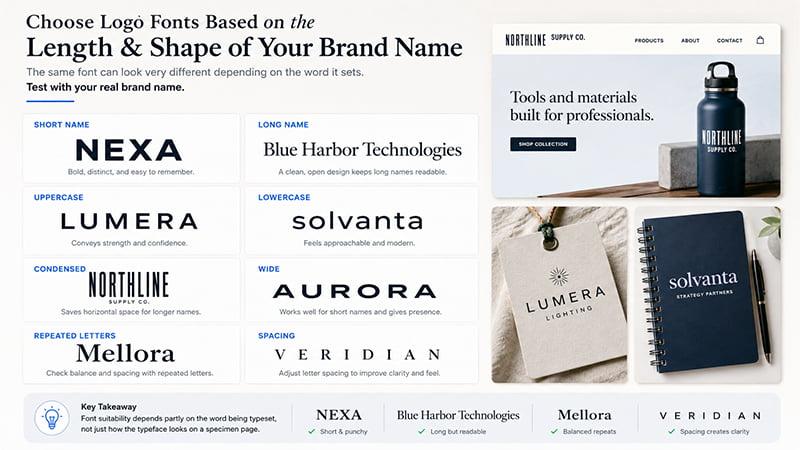
Always test fonts with the real brand name.
A dramatic display font may work beautifully for a five-letter name but feel crowded across a long corporate wordmark. A wide geometric typeface may also suit a short name better than a company name containing several long words.
Check:
- overall word width;
- uppercase versus lowercase;
- repeated letters;
- condensed versus wide forms;
- difficult letter combinations;
- character spacing.
Font suitability depends partly on the word being typeset, not just how the typeface looks on a specimen page.
Decide Whether You Need One Font or a Font Pair
Many logos need only one typeface.
A second font can help with a tagline, location, descriptor, or supporting message, but it should have a clear role. The primary wordmark should remain dominant, while supporting typography can create hierarchy through size, weight, width, or style.
Most brand identities benefit from a limited type system. Adding another font simply because it looks interesting usually creates more visual noise rather than stronger branding.
Test Size, Readability, and One-Color Performance
Do not evaluate a logo only at the large size shown inside a design program.
Test it in realistic situations such as:
- website headers;
- social profiles;
- business cards;
- packaging;
- garment chest logos;
- product labels;
- small promotional items.
The smallest realistic application often reveals more problems than the largest one.
Then check black, white, and one-color versions. If the lettering depends heavily on gradients, shadows, textures, or outlines to remain clear, the underlying type may need more work.
Check Language and Character Support
International brands should confirm language support before finalizing a typeface.
A font may work perfectly in basic English but lack characters needed for accented Latin languages, Vietnamese, Cyrillic, Greek, Arabic, or multilingual taglines.
Check the characters your brand will actually use before typography becomes part of a long-term identity system.
Shortlist and Test Your Final Options
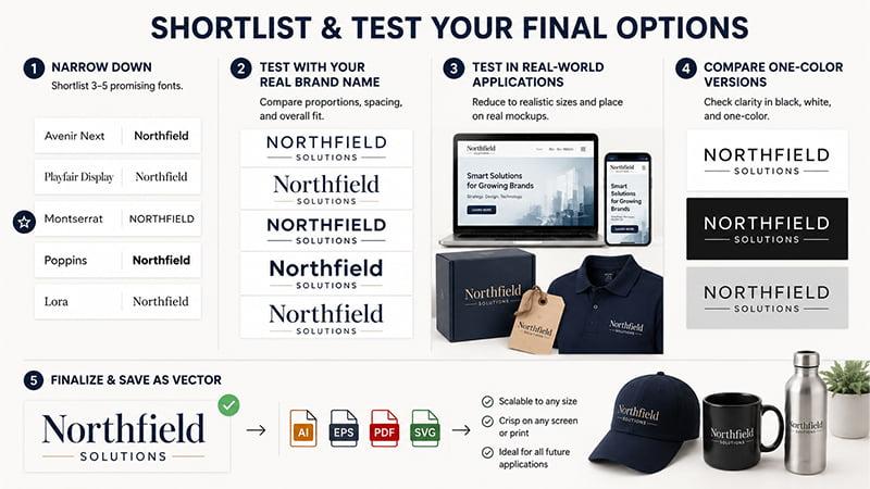
Narrow promising options to three to five fonts.
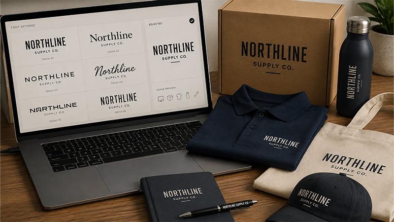
Apply each one to the real company name, compare proportions and spacing, reduce the wordmark to realistic sizes, and place it on actual website, packaging, apparel, and product mockups.
Also compare one-color versions before refining kerning and spacing.
Once the direction is approved, retain the final logo as vector artwork so it can be adapted more reliably across future digital and physical applications.
60 Cool Fonts for Logos by Style
The groups below are practical browsing categories rather than strict typography classifications, so some fonts could reasonably fit more than one group.
This list is intended as inspiration rather than a ranking. Some historical font families also exist in multiple digital versions, so always check the exact font and license you plan to use.
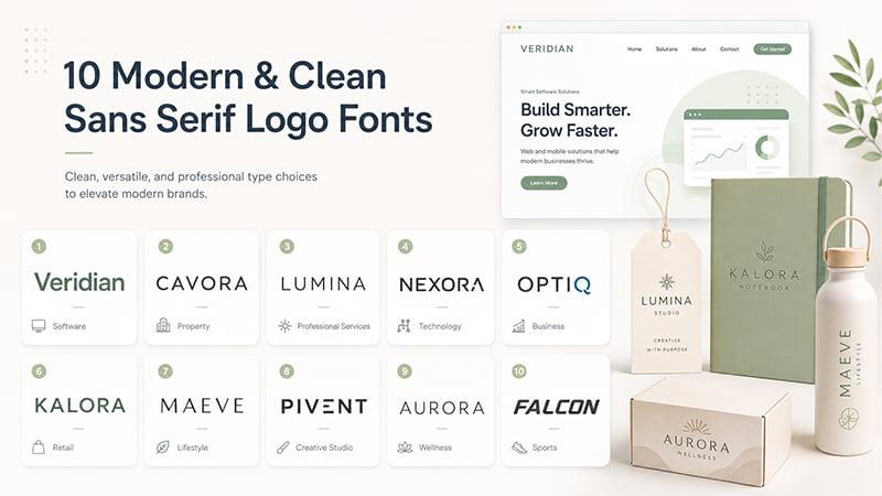
10 Modern & Clean Sans Serif Logo Fonts
1. Inter feels crisp and restrained. It is a dependable option for software, technology, professional services, and other digital-first brands.
2. Montserrat feels geometric and confident. Its clean shapes work well for corporate, property, education, and event branding.
3. Avenir combines geometric structure with a softer character. It can give professional and forward-looking brands a polished modern feel.
4. Proxima Nova feels balanced and versatile. Its approachable proportions work well for digital companies, service brands, and modern consumer businesses.
5. Work Sans is straightforward and practical. It suits businesses that want modern typography without an overly stylized or futuristic look.
6. Plus Jakarta Sans feels clean without looking cold. It can suit startups, wellness brands, digital services, and contemporary retail.
7. Outfit uses sleek geometric forms. It works especially well for technology brands, creative studios, and businesses with a minimal visual identity.
8. Archivo is flexible across multiple weights. This makes it useful when the wordmark and supporting brand typography need to feel consistent.
9. Urbanist feels contemporary and refined. It can work well for property, architecture, lifestyle, and modern service businesses.
10. Barlow adds subtle human character to a clean sans serif structure. It suits sports, transportation, corporate, and industrial identities.
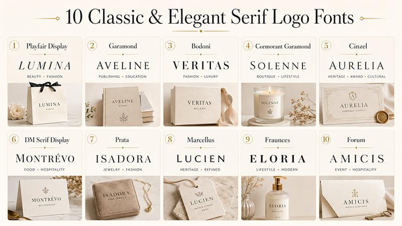
10 Classic & Elegant Serif Logo Fonts
11. Playfair Display feels elegant and editorial. It works well for beauty, hospitality, fashion, and premium brands. Test its fine strokes at small sizes.
12. Garamond feels classic and understated. It can give publishing, education, hospitality, and heritage brands a more established look.
13. Bodoni uses dramatic contrast between thick and thin strokes. It creates a sophisticated look, but delicate details need testing when reduced.
14. Cormorant Garamond is expressive and refined. It can suit boutique hospitality, beauty, lifestyle, and artistic brands.
15. Cinzel feels formal and architectural. It is worth considering for cultural, property, heritage, award, and ceremonial branding.
16. DM Serif Display has a strong editorial character without feeling overly traditional. It can work for food, hospitality, lifestyle, and contemporary consumer brands.
17. Prata combines high contrast with polished proportions. It is a strong option for beauty, jewelry, fashion, and premium positioning.
18. Marcellus brings classical influence without heavy decoration. It can suit brands that want a refined heritage feel with cleaner letterforms.
19. Fraunces gives serif typography a more playful, contemporary personality. It works well for food, lifestyle, creative, and modern consumer brands.
20. Forum feels formal and elegant, with a clear historical influence. It can suit hospitality, cultural, event, and premium identities.
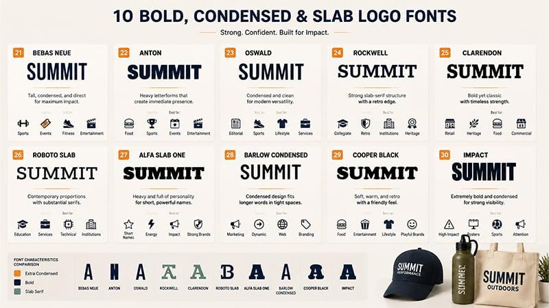
10 Bold, Condensed & Slab Logo Fonts
21. Bebas Neue feels tall, condensed, and direct. It works well for sports, events, fitness, entertainment, and short names that need impact.
22. Anton uses heavy letterforms to create immediate presence. It can suit energetic brands, food concepts, sports, events, and entertainment.
23. Oswald is condensed but cleaner than many display fonts. It works across editorial, sports, lifestyle, and modern service branding.
24. Rockwell has a recognizable slab-serif structure. It can make a wordmark feel sturdy, confident, collegiate, or deliberately retro.
25. Clarendon feels bold without becoming overly rigid. It can suit heritage, food, retail, and traditional commercial identities.
26. Roboto Slab combines contemporary proportions with substantial serifs. It works well for education, professional services, technical brands, and institutions.
27. Alfa Slab One is heavy and full of personality. It works best for short names where strong visual character matters more than subtlety.
28. Barlow Condensed helps longer wordmarks fit into narrower spaces. It still keeps a modern and energetic appearance.
29. Cooper Black feels soft, warm, and unmistakably retro. It works especially well for food, entertainment, lifestyle, and playful consumer brands.
30. Impact is extremely bold and condensed. It delivers strong visibility, but its familiarity makes distinctive execution especially important.
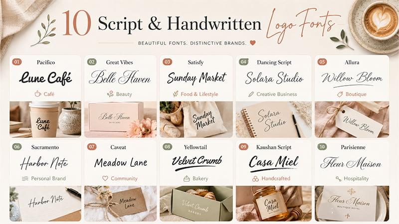
10 Script & Handwritten Logo Fonts
31. Pacifico feels relaxed and flowing. Its retro warmth works naturally for cafés, travel, food, hospitality, and lifestyle brands.
32. Great Vibes brings elegant calligraphy to beauty, events, and hospitality. Intricate joins and flourishes need generous reproduction space.
33. Satisfy has informal brush-script energy. It gives cafés, food brands, travel companies, and lifestyle identities a more personal feel.
34. Dancing Script feels friendly rather than formal. It can work well for education, creative businesses, food, and approachable lifestyle brands.
35. Allura is graceful and delicate. It is better suited to boutique, beauty, hospitality, and event identities where lettering can stay reasonably large.
36. Sacramento offers light signature-style lettering. It works for personal brands, cafés, lifestyle businesses, and understated handcrafted positioning.
37. Caveat feels loose and conversational. Its handwritten character can suit education, creative services, community projects, and playful consumer branding.
38. Yellowtail has more visual weight than many delicate scripts. Its compact retro character works particularly well for food and hospitality.
39. Kaushan Script uses bold brush lettering with expressive movement. It can give handcrafted brands a stronger and more energetic personality.
40. Parisienne feels romantic and refined. It is best for boutique, beauty, hospitality, and event logos where fine details remain visible.
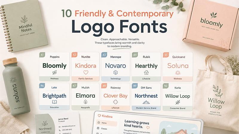
10 Friendly & Contemporary Logo Fonts
41. Poppins uses rounded geometric forms. It creates a clean but approachable personality for wellness, education, technology, lifestyle, and consumer brands.
42. Nunito has soft shapes and rounded terminals. That gives education, family services, wellness, and friendly technology brands a welcoming feel.
43. Manrope feels contemporary and restrained. It has enough polish for professional services, software, property, finance, and modern consumer brands.
44. Rubik adds warmth through slightly rounded forms. It balances professionalism with a more inviting appearance.
45. Quicksand uses lighthearted rounded lettering. It works best for friendly lifestyle, education, children’s, wellness, and creative identities.
46. Lato combines professional structure with subtle warmth. It gives corporate, nonprofit, education, service, and technology brands broad flexibility.
47. Mulish feels understated and clean. It suits brands seeking modern simplicity without strong decoration or rigid geometric character.
48. Raleway feels more editorial than many geometric sans serifs. Its lighter weights deserve extra testing when the logo becomes small.
49. DM Sans is straightforward and approachable. It can suit software, consumer products, wellness, education, and modern service brands.
50. Karla balances professional readability with a slightly conversational character. It works well for brands seeking a more human personality.
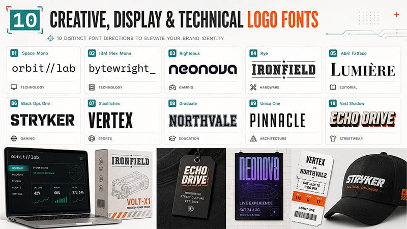
10 Creative, Display & Technical Logo Fonts
51. Space Mono feels monospaced and technical. It fits developer tools, experimental technology, hardware, and brands built around precision.
52. IBM Plex Mono feels controlled without becoming purely retro. It can suit engineering, software, hardware, and selected industrial identities.
53. Righteous uses rounded display forms with a retro-futuristic mood. It works for entertainment, gaming, music, technology, and lifestyle brands.
54. Rye brings strong vintage character. It can suit themed hospitality, craft, food, entertainment, and Americana-inspired identities.
55. Abril Fatface uses dramatic contrast. It works well for editorial, fashion, beauty, hospitality, and shorter names with generous visual space.
56. Black Ops One has angular, military-inspired lettering. It creates intensity for gaming, sports, entertainment, and selected event concepts.
57. Staatliches uses tall display proportions. It brings strong visual rhythm to events, streetwear, entertainment, posters, and short wordmarks.
58. Graduate has a clear collegiate structure. It naturally fits education, sports, alumni programs, clubs, and heritage merchandise.
59. Unica One feels narrow and unusual without becoming excessively decorative. It can suit creative, architecture, fashion, and entertainment identities.
60. Vast Shadow uses dimensional retro styling. It brings a bold personality to food, events, entertainment, and vintage-inspired packaging.
The best logo font is not necessarily the most distinctive font on this list. It is the one that matches the brand, remains readable, and works in the applications the identity actually needs.
Will Your Logo Font Work on Promotional Products?
This is where typography becomes a production question.
Once a digital logo moves onto a real product, the branding area, material, product shape, and decoration method can all affect how the lettering appears.
Embroidery
Embroidery converts artwork into stitches rather than reproducing a vector image exactly.
Details worth reviewing include:
- thin strokes;
- tight letter spacing;
- tiny counters;
- small lowercase details;
- script joins;
- decorative flourishes.
A large script wordmark might work beautifully across a jacket or tote but lose clarity as small cap or chest embroidery.
There is no single font-size rule for every project. Fabric, artwork, stitch setup, letterform structure, and finished logo dimensions all matter.
Review the artwork at the intended embroidery size rather than only as an enlarged digital file.
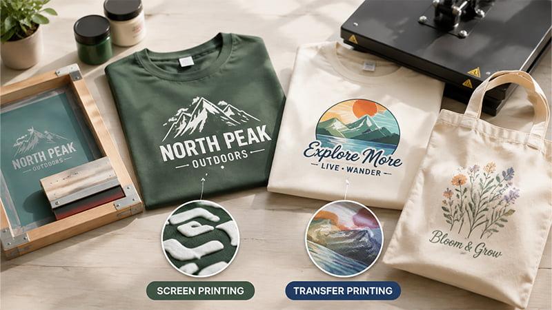
Screen Printing and Transfer Printing
Printing can reproduce many logo styles, but reducing the artwork still changes which details remain visible.
Very small text, distressed lettering, tight spaces, and fine decorative lines deserve closer review. A bold one-color wordmark may suit screen printing, while more detailed artwork may lead to another process depending on the product and project.
TOMAS Crafts’ guide to printing methods for custom products explains how product material, artwork complexity, surface shape, quantity, and other production factors can influence the decoration method.
If the logo will be used specifically on apparel, our guide to preparing T-shirt designs for printing also covers artwork, placement, fabric, printing methods, and print-ready file preparation.
Laser Engraving and Debossing
Engraving and debossing place more emphasis on the underlying letter shapes because much of the color information disappears.
Pay particular attention to:
- fine serif contrast;
- very tight spacing;
- small counters;
- narrow internal gaps;
- delicate flourishes.
A high-contrast serif may work well as a large notebook deboss but need more testing when the same wordmark is engraved much smaller on a metal pen.
Material and surface matter too. Coated drinkware, anodized metal, leather-like surfaces, and rigid plastic do not all reproduce artwork in exactly the same way.
Small or Narrow Logo Areas
A long wordmark may fit comfortably on a T-shirt or tote bag but become crowded on a pen, lanyard, keychain, bottle lid, or compact accessory.
Before approving the artwork, compare the available decoration area with the real proportions of the wordmark rather than assuming one logo setup will suit every product.
TOMAS Sourcing Example: One Logo, Different Products, Different Decoration Decisions
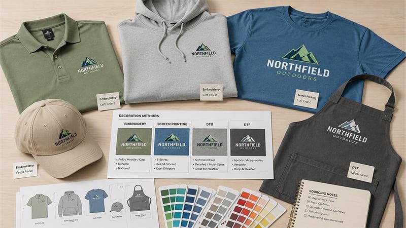
In a real TOMAS Crafts sourcing inquiry for an Australian corporate apparel buyer, the planned range included polo shirts, hoodies, T-shirts, hats, and aprons. The decoration options under consideration included embroidery, screen printing, DTG, and DTF.
The same brand logo could potentially appear across the range, but that did not mean one artwork setup would automatically suit every item. A logo with plenty of space as a larger T-shirt print may require a different size, placement, or decoration approach when applied to a hat or polo.
Before the project could move forward, details such as the garment material, logo artwork, sample requirements, and decoration method needed to be confirmed for the selected products.
The sourcing lesson is straightforward: when one logo will appear across several products, review the artwork against each product and decoration method instead of assuming one setup will work everywhere.
Once the logo system is ready, our guide to branded merchandise provides more ideas for applying branding across apparel, drinkware, bags, office products, and other promotional items.
Can You Use Any Font in a Business Logo?
A font should not become part of a permanent business identity until its license has been checked.
Free to download does not mean unlicensed. According to Google Fonts’ licensing guidance, fonts remain governed by licenses even when they are available at no cost.
Fonts released under the SIL Open Font License can generally be used in commercial design work, including logos, subject to the license terms. The official SIL Open Font License FAQ explains these permissions and restrictions in more detail.
Commercial font libraries can have different terms. Adobe Fonts’ licensing guidance allows activated fonts to be used in commercial logo artwork, while also distinguishing that use from redistributing the underlying font software to an unlicensed third party.
Before final approval, check:
- the exact font and version;
- its official license source;
- commercial and logo-use permissions;
- relevant modification rights;
- font-file redistribution restrictions.
For manufacturing, providing properly created outlined vector artwork can also reduce the need to transfer editable font files between the brand, designer, and supplier.
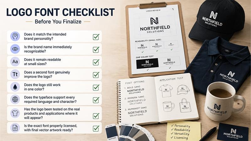
Quick Checklist Before Finalizing Your Logo Font
Before locking the typography, ask:
- Does it match the intended brand personality?
- Is the brand name immediately recognizable?
- Does it remain readable at small sizes?
- Does a second font genuinely improve the logo?
- Does the logo still work in one color?
- Does the typeface support every required language and character?
- Has the logo been tested on the real products and applications where it will appear?
- Is the exact font properly licensed, with final vector artwork ready?
Conclusion
The coolest font is not automatically the right font for your logo. The best choice balances brand personality, readability, versatility, licensing, and real-world reproduction.
Test the actual brand name at realistic sizes and in one color. If the logo will appear on physical products, also check the lettering against the final branding area and decoration method before production.
Need to Test Your Logo on Promotional Products?
Already have a logo or several font options? Share your vector artwork, product type, intended logo size, quantity, and preferred customization method, if known, with TOMAS Crafts.
TOMAS Crafts can help review how the artwork may translate to embroidery, printing, engraving, debossing, or other customization methods and identify details worth checking before bulk production.
Contact TOMAS Crafts to discuss your branded merchandise project.
FAQs
What Are the Best Fonts for Logos?
There is no single best font for every logo. Sans serifs such as Inter or Montserrat can suit contemporary identities, while Garamond or Playfair Display create a more refined serif direction.
The best logo fonts are those that fit the brand name, remain readable, support the intended personality, and work in the applications the business actually needs.
What Font Works Best for a Modern Logo?
Clean sans serif fonts are common starting points because their simple forms can create a current, uncluttered appearance. Inter, Montserrat, Avenir, Poppins, and Manrope are useful options to compare.
A modern logo does not have to use a sans serif, though. A contemporary serif or restrained display font can work equally well when it fits the brand.
Can I Use a Free Font for a Business Logo?
Often, but check the exact license.
Many open-source fonts permit commercial logo use, while other free downloads may carry different restrictions. A font being available at no cost does not remove its licensing terms.
Verify the official license for the exact font and version before making it part of a permanent business identity.
How Do I Know if a Logo Font Will Work for Printing, Embroidery, or Engraving?
Test the actual logo at its intended reproduction size. Fine strokes, tight spacing, small counters, and decorative details deserve extra attention.
Product material, available branding area, and decoration method can also affect clarity, so avoid relying on one universal font-size rule.