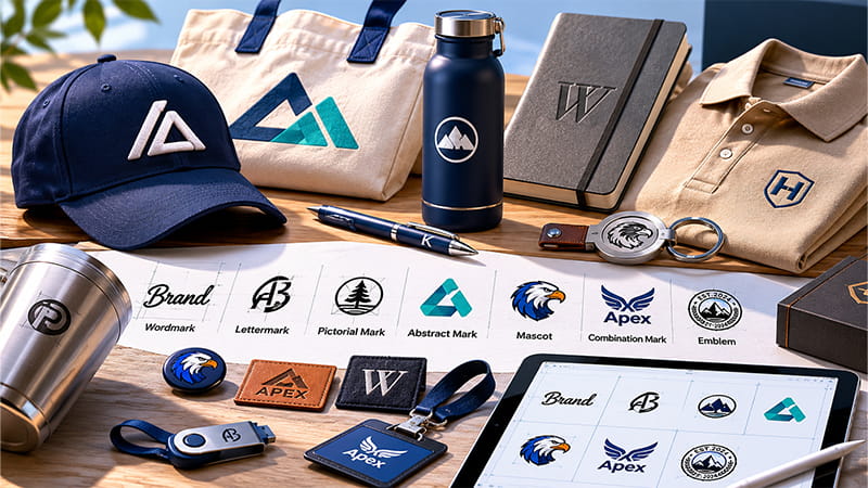
A logo is not only for websites or business cards. It is part of your brand identity, and it also appears on packaging, uniforms, drinkware, bags, badges, event merchandise and promotional gifts. This guide explains the 7 main types of logos, when to use each one, and how to choose a logo that stays clear across digital, print and branded products.
What Are the 7 Types of Logos?
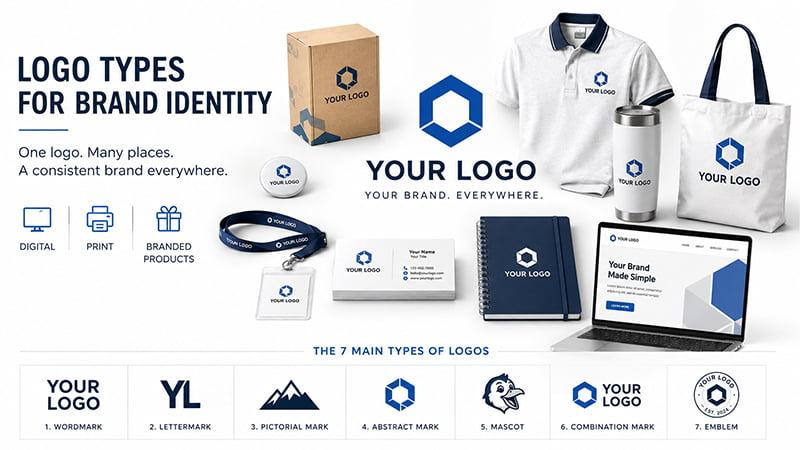
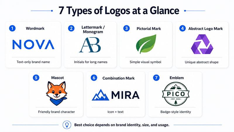
The 7 common types of logos are wordmark logos, lettermark or monogram logos, pictorial marks, abstract logo marks, mascot logos, combination mark logos and emblem logos.
Each type works in a different way. Some focus on the brand name. Some use a symbol. Others combine text and graphics for more flexibility.
Different types of logos support different parts of a brand identity. Some logo designs focus on the business name, while others use logo symbols, initials, characters or abstract shapes. The best choice depends on how the logo will be used across digital platforms, packaging and physical branded products.
Here is a quick comparison before we look at each logo type in detail.
| Logo Type | Best For | Watch Out For |
|---|---|---|
| Wordmark | Clear brand name recognition | Long names may not fit small products |
| Lettermark / Monogram | Long names or initials | Needs brand awareness |
| Pictorial mark | Simple visual identity | May need text for new brands |
| Abstract logo mark | Unique brand symbol | Can be hard to understand at first |
| Mascot | Friendly brands and events | Too detailed for small printing |
| Combination mark | Flexible brand systems | Can be crowded at small sizes |
| Emblem | Traditional or premium brands | Details can disappear when small |
For digital branding, many logo types can work if they look clear on screen. For physical products, the choice is more practical. A logo may look strong on a website but fail on caps, metal items, pens or small giveaways.
1. Wordmark Logos
What is a wordmark logo?
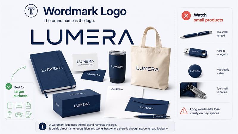
A wordmark logo uses the full brand name as the logo. It usually depends on custom typography, spacing, letter shape or subtle design details instead of a separate icon.
Common examples of logos in this category include brands like Google, Visa and Coca-Cola. The brand name itself becomes the main visual identity.
When to use a wordmark logo
Use a wordmark logo if your brand name is short, clear and easy to remember. It is also a good choice when you want direct name recognition without relying on an icon.
Wordmarks are especially useful for websites, business cards, packaging, office supplies and corporate stationery because the brand name stays visible. They also support brand recognition when the business name is easy to read.
Product branding advice
Wordmark logos usually fit larger or wider surfaces, such as notebooks, folders, tote bags, packaging, drinkware and business cards. These products provide enough space for the full name to stay readable.
For brands preparing notebooks, pens or desk items, custom office supplies can give the wordmark enough space to stay readable.
For small products, be careful. A long wordmark may become too small on pens, badges, USB drives, zipper pulls, metal accessories or narrow product surfaces. If your brand name is long, prepare a shorter version or icon version before sending artwork to a supplier.
2. Lettermark or Monogram Logos
What is a lettermark logo?
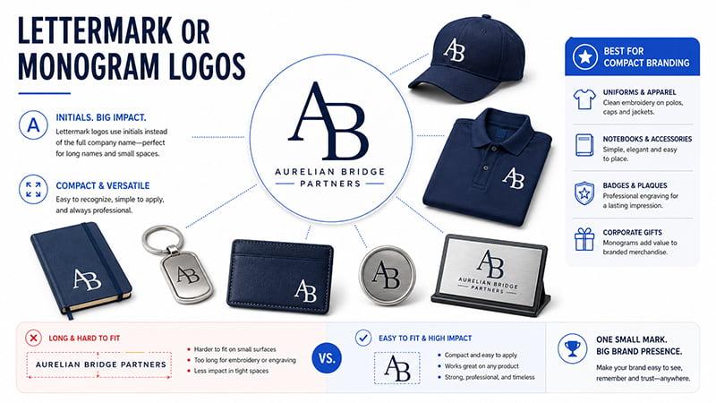
A lettermark logo, also called a monogram logo, uses initials or abbreviations instead of the full company name. It is often used when the full brand name is long or difficult to fit into small spaces.
Examples include IBM, HP, CNN and HBO. These logos turn initials into a compact visual identity.
Monogram logos are often built from a company’s initials or brand initials. They are helpful when the full business name is too long for small spaces. For B2B brands, monogram logos can also create a clean and professional look on uniforms, notebooks, badges and corporate gifts.
When to use a lettermark logo
Lettermarks are a strong option for long company names, B2B service brands, finance companies, schools, consulting firms, law firms and real estate brands.
They often feel professional, stable and easy to apply. If your full company name is long, a lettermark or monogram logo can make your logo easier to place on both digital and physical materials.
Product branding advice
Lettermarks and monogram logos are often a practical choice for caps, polo shirts, metal badges, notebooks, keychains, card holders and plaques.
They are usually easier to embroider or engrave than long wordmarks because they have fewer letters and cleaner shapes. For branded merchandise such as polo shirts, jackets, caps or badges, a simple lettermark can produce a cleaner result than a full company name with small text.
3. Pictorial Mark Logos
What is a pictorial mark logo?
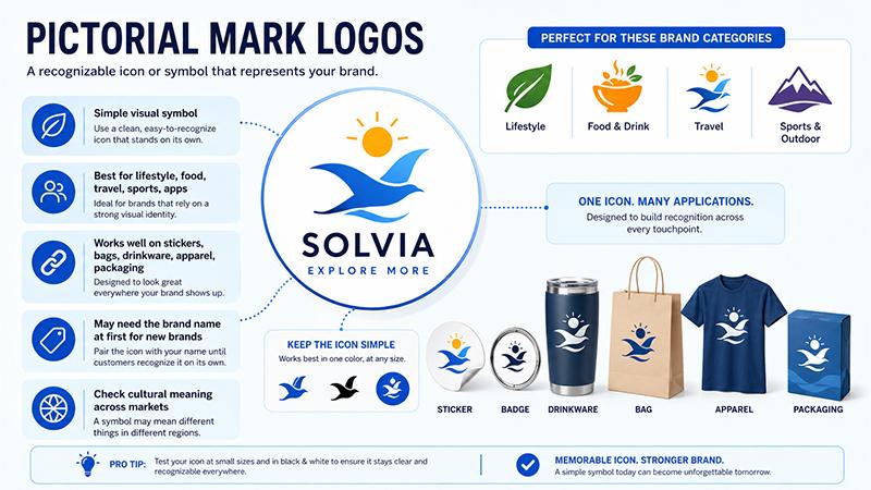
A pictorial mark is a recognizable icon, image or symbol that represents the brand. It can be a literal object, animal, shape or image connected to the company’s identity.
Common examples include Apple’s apple symbol and Target’s bullseye. The image becomes the brand’s visual shortcut.
A pictorial mark can also be described as a logo symbol or symbol logo. It works best when the image is simple enough to become a recognizable image on its own. For new brands, the symbol may need to appear with the company name until the audience builds brand recognition.
When to use a pictorial mark logo
Pictorial marks are useful for lifestyle brands, food brands, travel brands, sports brands, apps and consumer products. They are especially helpful when the brand needs a strong icon for social media, packaging or product labels.
A pictorial mark works best when the symbol is simple and memorable. New brands may still need to pair the icon with the brand name until customers recognize the symbol on its own.
Product branding advice
Pictorial marks are usually easier to apply on products with enough visible surface, such as stickers, badges, drinkware, bags, apparel, packaging and event merchandise.
The icon should be simple enough to work in one color. Thin lines, gradients and small inner details may disappear on small products or basic printing methods. Before using a pictorial mark across merchandise, test it at small sizes and in black and white.
Cultural symbolism risk
A symbol may carry different meanings across regions. For international campaigns or global merchandise, check whether the image could be misunderstood in the target market. This matters for tourism gifts, event merchandise, regional campaigns and products sold across multiple countries.
4. Abstract Logo Marks
What is an abstract logo mark?
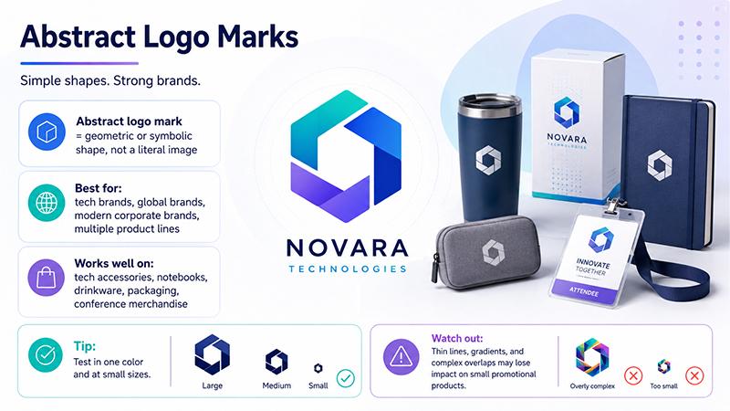
An abstract logo mark uses a geometric or symbolic shape instead of a literal image. It does not show a specific object. Instead, it creates a unique shape that represents the brand.
Nike’s swoosh is a well-known example of an abstract mark. The mark does not describe the product directly, but it has become strongly connected with the brand.
Abstract logo marks often work well when a brand wants to express brand values or brand personality without using a literal image. The shape can feel modern, energetic, premium or technical, depending on the color, line weight and form.
When to use an abstract logo mark
Abstract logo marks are useful for tech brands, global brands, modern corporate brands and companies with multiple product lines. They are also helpful when a brand does not want to be limited by a literal symbol.
Because abstract logo marks are not tied to a specific object, they can support companies that plan to expand into different product categories or international markets.
Product branding advice
Abstract logo marks often look cleaner on modern products such as tech accessories, notebooks, drinkware, packaging and conference merchandise.
Before approval, test the abstract logo mark in one color and at small sizes. A shape that looks strong on a website or presentation slide may lose impact on small promotional products, especially if the design uses thin lines, gradients or complex overlaps.
5. Mascot Logos
What is a mascot logo?
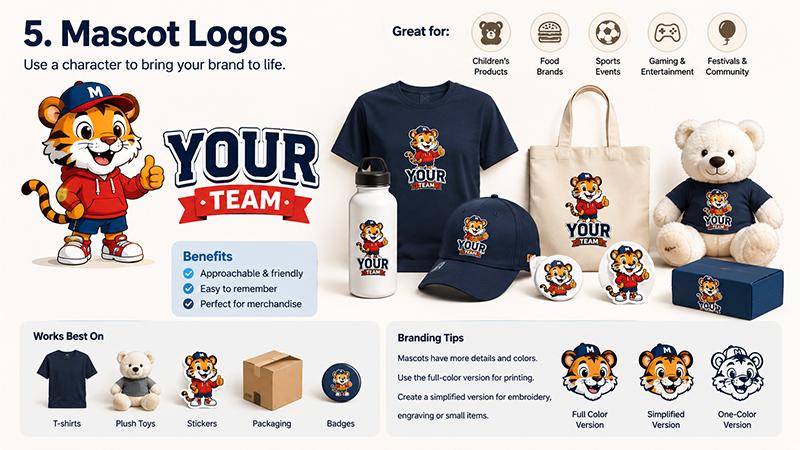
A mascot logo uses a character, animal, person or illustrated figure to represent the brand. It gives the company a more human, friendly or playful personality.
Common mascot examples include KFC’s Colonel Sanders or sports team characters.
When to use a mascot logo
Mascot logos are often a good fit for children’s products, food brands, sports events, gaming, entertainment brands, festivals, community events and family-friendly campaigns.
They can make a brand feel approachable and memorable. They are also useful for event merchandise because people often enjoy wearing or collecting character-based designs.
Product branding advice
Mascot logos usually perform best on products with enough space for color and detail, such as T-shirts, stickers, plush toys, packaging, badges and festival giveaways.
The challenge is detail. Mascots often include many colors, facial features, clothing, outlines and shading. They may work well for full-color printing, but not always for embroidery, laser engraving or small accessories. Prepare a simplified mascot version for caps, patches, badges, keychains or other small products.
6. Combination Mark Logos
What is a combination mark?
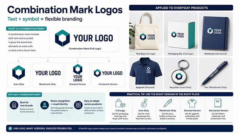
A combination mark includes both text and a symbol, icon or mascot. It gives the brand two elements to work with: a name and a visual mark.
Combination mark logos are common because they support both name recognition and visual identity. They can appear side by side, stacked or separated depending on the layout.
A combination logo can also become the primary logo in a brand system. From that primary logo, the brand can create logo variations such as an icon-only version, wordmark-only version, stacked version and horizontal version. These variations make the logo easier to apply across packaging, apparel and small promotional items.
When to use a combination mark
Combination mark logos are often a strong choice for new brands, trade show campaigns, corporate gifts, product packaging and event merchandise.
They are helpful when a brand needs both name recognition and visual identity. The text helps people remember the brand name, while the symbol gives the brand a visual shortcut.
Product branding advice
Combination mark logos are often the safest logo system for branded merchandise because they can be separated into different versions.
Use the full logo for packaging, tote bags, folders and larger print areas. Use the icon-only version for small giveaways. Use the wordmark-only version for pens or narrow product surfaces. Use a stacked version for apparel and a horizontal version for folders, notebooks or presentation kits.
For B2B branded merchandise, a combination mark gives buyers more flexibility than a single fixed logo layout. It helps the logo stay clear across products with very different shapes and print areas.
For multi-item gift sets, combination marks are usually easier to manage because the full logo can be used on packaging and apparel, while the icon or short wordmark can be used on small items.
7. Emblem Logos
What is an emblem logo?
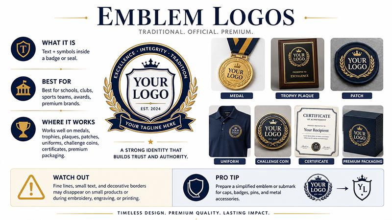
An emblem logo combines text and symbols inside a badge, seal, crest or enclosed shape. It often feels traditional, official or premium.
Examples include school crests, sports team badges, club seals and heritage-style brand marks.
Emblem logos often feel official, traditional or premium. They are common in organizations that want a structured or heritage-inspired visual identity.
When to use an emblem logo
Emblem logos are common in schools, clubs, sports teams, heritage brands, membership programs, awards, recognition products and premium packaging.
They can create a sense of authority, history or exclusivity. This makes them useful for certificates, challenge coins, trophies, medals and formal corporate recognition items.
Product branding advice
Emblem logos are commonly used on medals, trophies, plaques, patches, uniforms, challenge coins, certificates and premium packaging.
For awards, medals and recognition items, emblem logos can create a more formal look. The main risk is small detail. Emblem logos often include fine lines, small text and decorative borders. These details may disappear during embroidery, engraving or small-size printing.
Prepare a simplified emblem or submark early, especially if the logo will appear on caps, badges, pins or metal accessories.
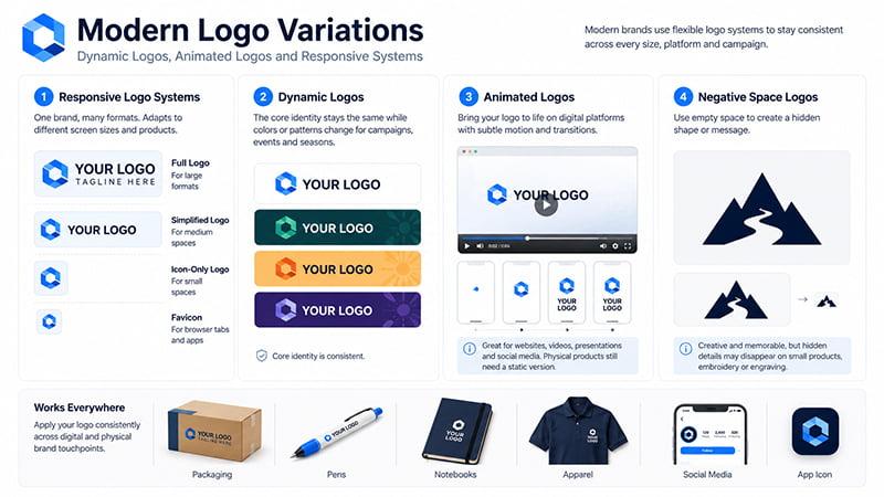
Modern Logo Variations: Dynamic Logos, Animated Logos and Responsive Systems
The 7 logo types cover the main categories, but modern brands often need flexible logo systems rather than one fixed file. Figma’s guide to logo types also explains that logo selection should consider practical use, visual impact and brand application.
Responsive logo systems
A responsive logo system includes a full logo, simplified logo, icon-only logo and favicon for different screen sizes and product sizes. This is useful when the same brand appears on websites, packaging, pens, uniforms and social media.
Dynamic logos
Dynamic logos can change color, pattern or layout for campaigns, events and seasonal branding. They can be useful for event merchandise, but the core identity should stay consistent.
Animated logos
Animated logos work well for websites, videos, presentations and social media. Physical products still need a static version for printing, embroidery, engraving or packaging.
Negative space logos
Negative space logos use empty space to create a hidden shape or message. They can be creative and memorable, but small hidden details may disappear on small products, embroidery or engraving.
Logo Design Tips: How to Choose the Right Logo Type
Good logo design is not only about choosing a beautiful style. It should support the brand identity, improve brand recognition and remain clear in real applications. The right logo type should match the business name, target audience, brand values and the products where the logo will appear.
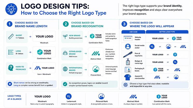
Choose based on brand name length
If your brand name is short, a wordmark can work well. It keeps the name visible and easy to remember.
If your brand name is long, a lettermark, monogram logo or combination mark may be better. A long name can look crowded on small products, especially pens, badges, USB drives and keychains.
If your name is difficult to pronounce, an icon plus wordmark can help people remember the brand visually.
Choose based on brand recognition
For a new brand, a combination mark is often safer because it includes both the brand name and a symbol. People can learn the name while also remembering the visual mark.
For an established brand, an icon, lettermark or abstract logo mark may work well because customers already know the company.
For an international brand, a pictorial or abstract mark may help across different languages, as long as the symbol is easy to understand and culturally safe.
Choose based on where the logo will appear
| Use Case | Better Logo Type |
|---|---|
| Website header | Wordmark or combination mark |
| Social media avatar | Lettermark, pictorial mark or abstract mark |
| Embroidery | Lettermark, simple wordmark or simplified emblem |
| Pens and small items | Lettermark or simple icon |
| T-shirts and tote bags | Combination mark, mascot or pictorial mark |
| Trophies and medals | Emblem, lettermark or simplified icon |
| Packaging | Combination mark, wordmark or emblem |
Once the logo type is chosen, the next question is whether it can stay clear on real products such as caps, bottles, notebooks, packaging and small giveaways.
Logo Types for Promotional Products and Custom Printing
This is where logo choice becomes practical. A logo may look good in a brand presentation, but the real test comes when it is printed, embroidered, engraved or applied to different product materials.
In bulk branding projects, the biggest issue is rarely the logo style itself. Problems usually come from using one complex logo file across too many product sizes, materials and branding methods.
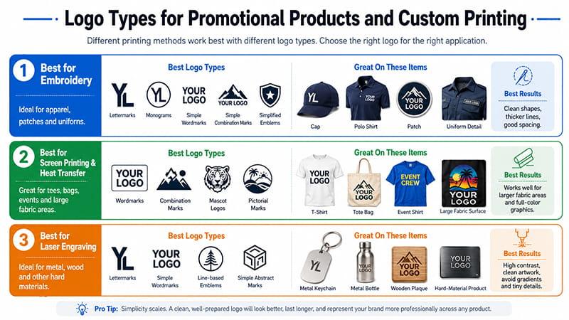
Best logo types for embroidery
For embroidery, the safest logo types are usually lettermarks, monogram logos, simple wordmarks, simple combination marks and simplified emblems.
Embroidery does not handle tiny text, gradients or complex details well. Clean shapes, thicker lines and enough spacing usually stitch better. This is especially important for caps, polo shirts, jackets, patches and uniforms.
Best logo types for screen printing and heat transfer
Screen printing and heat transfer fit wordmarks, combination mark logos, mascot logos and pictorial marks.
These methods are suitable for T-shirts, tote bags, event shirts, uniforms, festival merchandise and large fabric surfaces. Full-color graphics can work, but the artwork should still be clean enough to read from a normal viewing distance.
Best logo types for laser engraving
Laser engraving usually works best with lettermarks, simple wordmarks, line-based emblem logos and simple abstract logo marks.
Engraving needs clean, high-contrast artwork. Gradients, tiny filled details and complex mascot illustrations may not engrave clearly on metal, wood or other hard materials.
Best logo types for small giveaways
Small giveaways need simple logos. Pens, pins, USB drives, zipper pulls, badges and keychains have limited print areas. A lettermark, monogram logo, simple icon or short wordmark will usually stay clearer than a detailed full logo.
If the full logo is too complex, prepare a simplified version before production. This prevents last-minute artwork changes and keeps the brand consistent across the whole project.
Logo type by product category
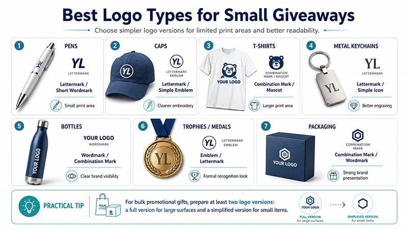
| Product Type | Better Logo Type | Why |
|---|---|---|
| Pens | Lettermark / short wordmark | Small print area |
| Caps | Lettermark / simple emblem | Cleaner embroidery |
| T-shirts | Combination mark / mascot | Larger print area |
| Metal keychains | Lettermark / simple icon | Better engraving |
| Bottles | Wordmark / combination mark | Clear brand visibility |
| Trophies / medals | Emblem / lettermark | Formal recognition look |
| Packaging | Combination mark / wordmark | Strong brand presentation |
For bulk custom promotional gifts, TOMAS Crafts recommends preparing at least two logo versions: a full version for large surfaces such as bags, packaging and T-shirts, and a simplified version for small products such as pens, badges, lanyards and metal accessories. This keeps the brand consistent without forcing one complex logo onto every product.
If your project includes apparel, drinkware, bags, office items and packaging, prepare the logo system before sampling. This will reduce artwork revisions and help each product look like part of the same branded campaign.
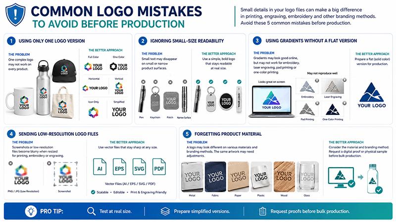
Common Logo Mistakes to Avoid Before Production
Using only one logo version
A single complex logo may not work on every product. Prepare full-color, one-color, horizontal, vertical, icon-only and simplified versions before production.
Ignoring small-size readability
Small text may disappear on pens, keychains, patches, embroidery or narrow product surfaces. Test the logo at the actual print size, not only on a large screen.
Using gradients without a flat version
Gradients may look good online, but they may not work for embroidery, laser engraving, pad printing or one-color printing. Prepare a flat version for production.
Sending low-resolution logo files
A screenshot may look fine in an email, but it often becomes blurry once the logo is resized for printing, embroidery or engraving. Screenshots and low-resolution PNG or JPG files are risky for production.
Vector files such as AI, EPS, SVG or editable PDF are better because they stay sharp when resized. If you only have a PNG or JPG file, ask your designer or supplier whether it should be redrawn into a vector file before sampling.
Forgetting product material
A logo may look different on metal, fabric, plastic, paper, leather, silicone, ceramic, glass or wood. The same artwork may need small adjustments depending on the product material and branding method.
For complex logos, especially mascot, emblem or gradient designs, request a digital proof or physical sample before bulk production.
Buyer Situation: Safer Logo Choices
Use this table before sending artwork for production.
| Buyer Situation | Safer Logo Choice |
|---|---|
| Need embroidery on caps | Lettermark or simplified emblem |
| Need logo on pens | Short wordmark or simple icon |
| Need full-color event T-shirts | Combination mark or mascot |
| Need metal engraving | Lettermark or simple line logo |
| Need multiple gift items | Combination mark with simplified version |
| Only have PNG/JPG file | Convert to vector before sampling |
| Need premium awards or medals | Emblem or simplified lettermark |
| Need packaging and giveaways together | Full logo for packaging, simplified logo for small items |
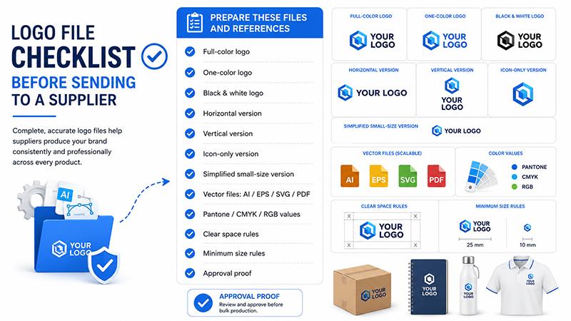
Logo File Checklist Before Sending to a Supplier
For production, vector files are usually safer than raster screenshots because they can scale without losing sharpness. Adobe’s vector file guide explains that vector files are built with mathematical formulas, while raster files are made of pixels.
Before sending your logo to a supplier, prepare these files and references:
- Full-color logo
- One-color logo
- Black and white logo
- Horizontal version
- Vertical version
- Icon-only version
- Simplified small-size version
- Vector file: AI / EPS / SVG / editable PDF
- Pantone / CMYK / RGB color values
- Clear space rules
- Minimum size rules
- Approval proof before bulk production
For larger corporate gift solutions, this checklist helps keep the logo consistent across apparel, packaging, office supplies, drinkware and event merchandise.
Conclusion
The 7 main types of logos are wordmark, lettermark, pictorial mark, abstract logo mark, mascot, combination mark and emblem. The right choice depends on your brand identity, brand recognition, business name, target audience, usage and production method.
For branded products, the best logo design is not only visually attractive. It also needs to reproduce clearly across different materials, sizes and printing methods.
If your logo needs to appear on corporate gifts, uniforms, packaging, event merchandise or promotional giveaways, TOMAS Crafts can help review your logo type, product surface, printing method and file setup before bulk production. Share your logo file, product list, quantity, target deadline and preferred branding method, and the TOMAS Crafts team can suggest practical logo options before sampling. You can also contact TOMAS Crafts for custom logo product support.
FAQs
What are the 7 types of logos?
The 7 common logo types are wordmark logos, lettermark or monogram logos, pictorial marks, abstract logo marks, mascot logos, combination marks and emblem logos. Each type works differently depending on the brand name, brand identity, recognition level, design style and final application.
Which logo type is best for promotional products?
Simple wordmarks, lettermarks, monogram logos and combination mark logos usually work best for promotional products because they are easier to print, embroider or engrave across different product sizes. For small items such as pens, badges and keychains, a simplified icon or short wordmark is often safer.
Why does my logo look blurry on merchandise?
A logo may look blurry if the file is low resolution, too detailed or not prepared as a vector file. Screenshots and low-resolution PNG or JPG files can lose sharpness when resized. For production, AI, EPS, SVG or editable PDF files are usually safer.
What logo file format should I send to a supplier?
Vector files such as AI, EPS, SVG or editable PDF are best for production because they can be resized without losing quality. For bulk orders, also prepare full-color, one-color, black-and-white, horizontal, vertical and simplified logo versions.