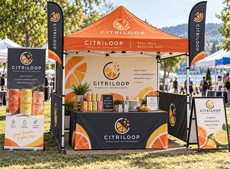
Limited booth space gets crowded quickly once signage, products, staff, giveaways, and backup stock all need to fit into the same area.
What matters is not how much you can fit in. Visitors should be able to spot the booth, understand the offer, enter without obstacles, and know what to do once they stop.
The setup also needs to keep working several hours into the event. The ideas below will help you decide what deserves space, what should stay out of sight, where interaction should happen, and how to turn booth traffic into a clear next step.
Decide What Your Vendor Booth Needs to Do
Before choosing displays or promotional materials, decide what should happen after someone approaches the booth.
Direct sales call for easy product access, visible pricing, and straightforward checkout. Lead-generation booths need more room for conversation and demonstrations, while sampling setups have to manage visitor flow and replenishment.
| Booth Goal | Main Priority |
|---|---|
| Sell products | Product display, pricing, checkout |
| Generate leads | Conversation, demo, contact capture |
| Offer samples | Sampling area, visitor flow, stock |
| Build awareness | Visibility, interaction, branded takeaway |
Decide what you want visitors to do before deciding what to put in front of them.
Vendor Booth Ideas That Improve Visibility
1. Make the Main Message Clear From the Aisle
People walking past should not need to study several lines of text before they understand the booth. From the aisle, the main display only needs to answer three questions: who are you, what do you offer, and why is it worth looking closer?
Most visitors need very little information at first. A brand name, one short message, and one strong product image can be enough. Specifications, detailed benefits, and longer explanations belong closer to the product or conversation area, where people have already chosen to stop.
Signage also changes with viewing distance. Large backdrops and banners help introduce the booth from farther away, while tabletop and directional signs become more useful once someone is nearby. The TOMAS Crafts guide to Types of Signs explains how different sign formats work across event and promotional settings.
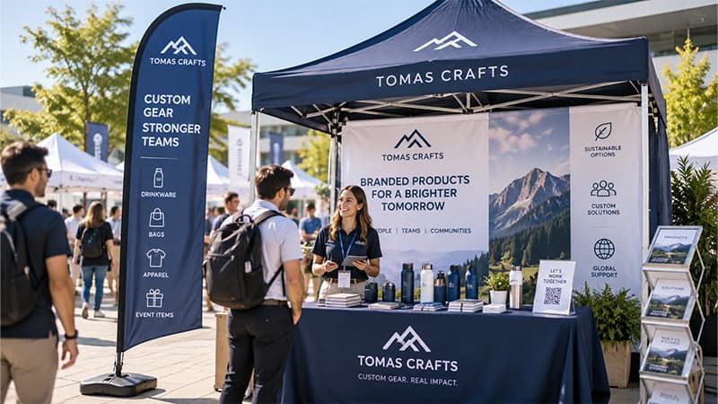
Distance messaging should earn attention. Close-up messaging should explain the details.
2. Use Height Before Adding More Table Space
Adding another table rarely solves a visibility problem. It usually takes away walking space while leaving the most noticeable part of the booth at the same height.
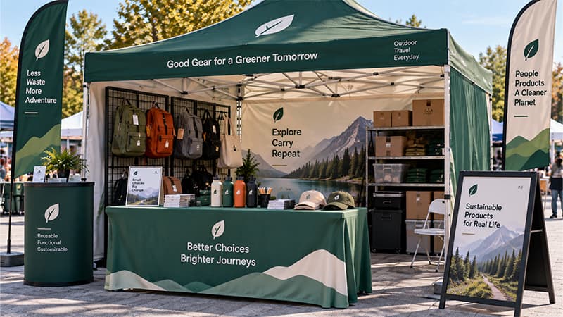
Backdrops, banners, flags, and raised displays move important information above tables and surrounding visitors. That leaves table-level space available for products, samples, demonstrations, and conversations.
Retractable banners work well for this reason: the main message can sit above the working surface instead of competing with whatever is happening on the table. The TOMAS Crafts Standard Banner Sizes guide can help when deciding which display dimensions make sense for the available space.
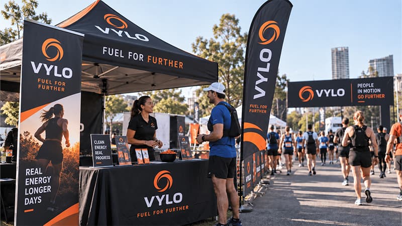
High displays help people find the booth. Table-level displays help people interact with it.
3. Build One Visual System Across the Booth
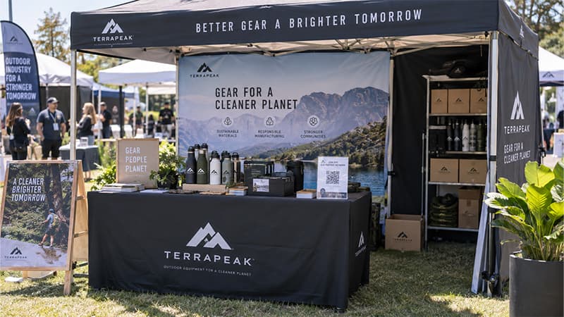
Consistency across the table cover, banner, staff clothing, lanyards, bags, and giveaways helps separate booth materials read as one brand. Repeating the same oversized logo everywhere does not.
Scale and material both change how artwork should be handled. Large graphics can carry more detail, while narrow lanyards or compact giveaways may need a simplified mark. Brand color may carry more visual weight on some products than the logo itself.
Vendor Booth Setup Ideas for Layout and Visitor Flow
4. Keep the Entrance Open
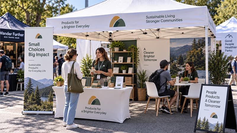
Placing a full-width table across the front gives staff somewhere to work, but it can also turn the booth into a counter that visitors never actually enter. Display racks, cartons, or several team members clustered near the opening can create the same effect.
Think about the visitor path in four steps:
See → Enter → Interact → Leave
Complete openness is not necessary. What matters is removing unnecessary friction between the aisle and the first meaningful interaction.
5. Give Each Table One Main Job
Tables become difficult to use once products, samples, signup forms, giveaway boxes, payment equipment, staff drinks, and personal items all compete for the same surface.
Instead of asking one table to handle everything, decide what its main job is. One might support demonstrations, another checkout, while a smaller surface could handle samples or lead capture.
Clear purpose makes the space easier to understand from the visitor side and easier to maintain from the staff side.
6. Create Clear Zones in a 10 × 10 Booth
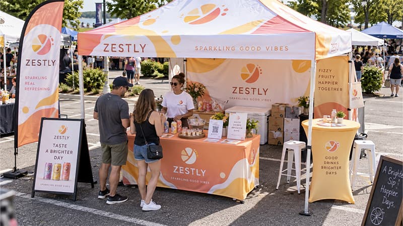
Even a small booth works better when each part of the space has a purpose. Use the front to attract attention and make entry easy, then move product interaction slightly farther inside. Conversation can happen to one side, while spare stock and cartons stay toward the back.
This is not a rigid floor plan. Sampling may require more open space near the front, while a B2B booth built around consultations may need a larger conversation area.
Not everything belongs at the front. When products, brochures, giveaways, displays, and staff all compete for those first few feet, visitors may see more but understand less.
IAEE notes that 10 ft × 10 ft linear booths are a common U.S. exhibition format, while height and sightline restrictions can affect how that space is used. Check the individual event’s exhibitor rules before finalizing the layout or producing large display graphics.
7. Plan Storage Before the Booth Opens

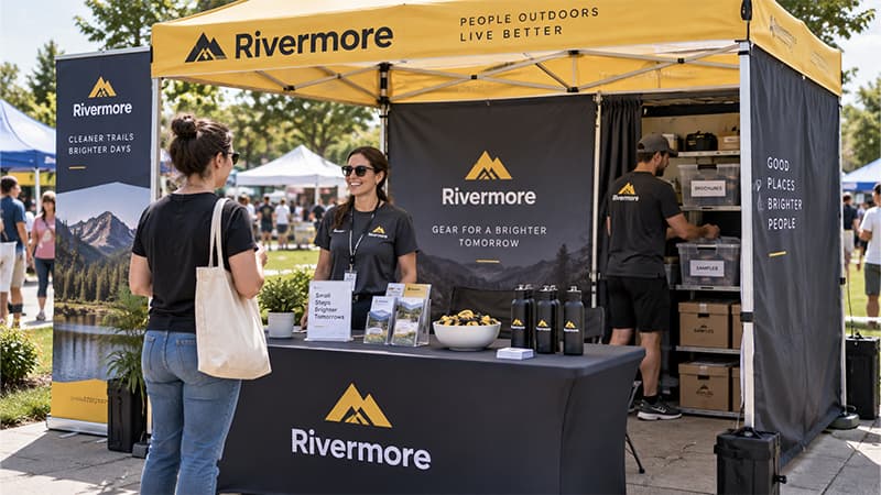
Opening-time photos rarely show the operational side of a booth. Giveaways are still packed neatly, tables are clear, and staff have not yet accumulated drinks, bags, spare brochures, and replacement stock.
Several hours of activity can change that quickly. Without planned storage, cartons and supplies gradually move into customer-facing areas. Covered boxes, under-table storage, organized refill cartons, or a dedicated back section can keep the visible space under control.
Restocking deserves attention as well. Staff should be able to replace brochures, samples, or giveaways without moving large cartons through the middle of an active conversation.
The real test is not whether a booth looks clean when the event opens. It is whether it can still stay organized several hours later.
Vendor Booth Layout by Zone
Thinking in functions makes the layout easier to plan.
| Zone | Purpose | Typical Elements |
|---|---|---|
| Visibility | Help people find the booth | Main sign, banner, flag |
| Entry | Make the booth easy to approach | Open path |
| Interaction | Support demos and conversations | Product, sample, staff |
| Conversion | Complete the next step | QR code, signup, checkout |
| Takeaway | Extend the interaction | Brochure, bag, giveaway |
| Storage | Keep the booth organized | Stock, cartons, staff items |
These zones do not need six separate physical areas. Smaller booths may combine several functions, as long as every important job still has somewhere to happen.
The distinction is useful because layout is not only about where objects sit. It is also about making sure visibility, interaction, conversion, and day-to-day operations do not compete for the same space.
Vendor Booth Ideas That Encourage Interaction
8. Let Visitors Touch, Try, or Test Something
Hands-on interaction can explain an offer faster than another paragraph of display copy. Food brands can provide samples, technology companies can demonstrate a feature, and material suppliers can let visitors compare finishes, textures, or swatches.
Service businesses can apply the same idea through a short demonstration or a clear before-and-after example. The activity does not need to be elaborate; it simply needs to help someone understand something useful about the offer.
Busy-looking activities add little when they do not help visitors make a decision.
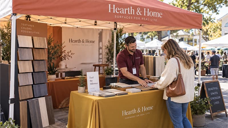
9. Add One Relevant Interactive Element
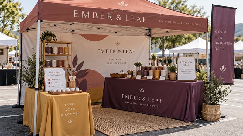
Votes, product quizzes, quick challenges, spin wheels, and photo opportunities can all give people a reason to stop. Their value depends on how closely they connect to the product or audience.
Taste voting makes sense for a food brand. Skill challenges fit naturally into sports promotions. Product demonstrations can become short tests when visitors are invited to compare results or try a feature themselves.
More visitors do not always mean more relevant visitors. An unrelated game may build a queue while doing very little to explain the offer or identify potential customers.
10. Make Staff Easy to Identify
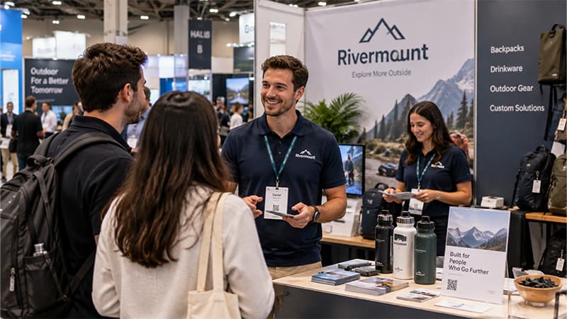
Visitors should be able to recognize the people who can answer questions without having to ask who works there.
Branded T-shirts, polos, caps, badges, and lanyards can provide enough visual consistency without turning every staff member into a large advertisement. Placement within the booth matters just as much: keeping the whole team seated behind a table makes even an open booth feel less approachable.
Consultation-heavy and B2B setups usually benefit from having at least one person easy to approach near the interaction area rather than behind a physical barrier.
11. Use Giveaways to Support a Visitor Action
Giveaways work better when their role is decided before the event. Leaving every item at the front may empty the table quickly, but distribution alone says very little about whether useful conversations happened.
Match the item to the interaction instead. General foot traffic might receive a simple, low-cost item. Someone who completes a demonstration, requests information, or spends time discussing a project may justify something different. Existing customers or qualified prospects can sit at another level again.
A giveaway should support a visitor action, not simply disappear from the table.
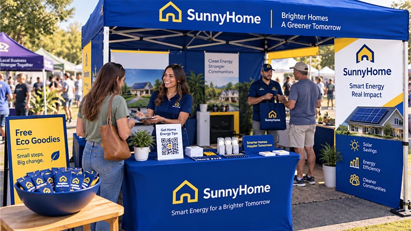
More product-specific ideas by event goal and visitor type are covered in the TOMAS Crafts Trade Show Giveaways guide.
12. Make the Next Step Obvious
Getting someone to stop is only the beginning. Interest needs somewhere to go.
Retail setups may move directly toward visible pricing and checkout. B2B booths often need a short conversation, QR code, or contact form. Product launches can move from demonstration to scan and follow-up, while school or community events may focus on registration or information collection.
People should not have to search for a price, wonder where to sign up, or guess whether a QR code matters. Attracting traffic and converting traffic are different jobs.

Outdoor Vendor Booth Ideas for Wind, Weather, and Setup
13. Plan for Wind Before Decoration
Outdoor displays have to survive real conditions, not just look good in a mockup. Loose brochures, lightweight signs, tabletop cards, props, and unsecured graphics can become difficult to manage well before weather turns severe.
Stability should come before decoration. Material choice also matters because vinyl, mesh, fabric banners, polyester flags, and different mounting systems behave differently outdoors. The TOMAS Crafts Types of Banners guide explains how common formats differ.
Weather planning also goes beyond protecting booth materials. The National Weather Service recommends that outdoor events plan for relevant hazards, communication, shelter or evacuation, and enough time to act when conditions change.
National Weather Service Event Ready Guide. Venue anchoring, weather, and safety requirements should always take priority over decoration.
14. Protect Products From Sun, Rain, and Uneven Ground
Outdoor conditions affect more than the display structure. Direct sunlight can create glare on screens and glossy graphics, heat may affect sensitive products, and rain can damage cartons, brochures, or backup stock before the main display itself has a problem.
Ground surfaces change the setup too. Equipment that sits evenly on an exhibition-hall floor may behave differently on grass, pavement, gravel, or uneven terrain.
Keep spare stock away from wet surfaces, protect moisture-sensitive materials, and consider how both staff and visitors will move through the booth under the actual site conditions.
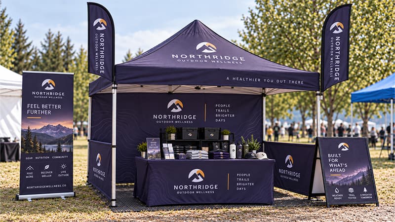
15. Choose a Setup You Can Transport and Rebuild
What looks impressive in a rendering can become frustrating on event day if the team cannot carry, assemble, or reuse it easily.
Check the practical details before approving the setup: how many people are needed, how long installation takes, whether special tools are required, whether everything fits in the planned vehicle, and how much of the system can be used again.
Portable, foldable, modular, and carry-case-friendly components are especially useful for repeat exhibitors. Reusable systems that adapt to several booth sizes may provide more value than one elaborate setup designed for a single event.
What Should You Include in a Vendor Booth Kit?
Build the booth kit around the job of the space rather than a universal shopping list.
| Function | Typical Items | Especially Useful When |
|---|---|---|
| Visibility | Sign, banner, flag | Nearby booths compete for attention |
| Branded surface | Table cover | The booth needs a cleaner display or working area |
| Staff identification | Badge, lanyard, apparel | Several staff members share the space |
| Interaction | Sample, demo material, display product | The offer is easier to show than explain |
| Takeaway | Brochure, bag, giveaway | Visitors need something after leaving |
| Operations | Storage, backup supplies | The event runs all day or across several days |
Not every event requires every item. Booth goal, audience, venue, and visitor action should determine the final combination.
When several branded products are being prepared for the same event, planning them together can also make artwork, quantities, packaging, and delivery easier to coordinate.
Common Vendor Booth Setup Mistakes
Most booth problems come back to a handful of practical mistakes:
- Too much information from the aisle: visitors cannot identify the main message quickly.
- Blocking the entrance: tables or displays make people more likely to remain outside the booth.
- Giving every product equal priority: nothing becomes the clear focal point.
- Ignoring hidden storage: stock, cartons, and staff items gradually move into customer-facing areas.
- Giving away products without a purpose: items disappear without supporting a useful visitor action.
- Keeping all staff behind barriers: conversations become harder to start.
- Skipping the full test setup: layout, missing parts, and usability problems first appear at the venue.
Testing the complete setup before packing can expose issues that are easy to miss when signage, tables, promotional products, and staff materials are reviewed separately.
Vendor Booth Checklist Before Event Day
Review the booth as one complete working space before everything is packed.
- Confirm booth dimensions and venue display rules.
- Check whether the event is indoor or outdoor.
- Confirm available power if needed.
- Review the main message and signage.
- Check table and display placement.
- Prepare staff clothing, badges, or lanyards.
- Test demonstrations and samples.
- Confirm pricing, QR codes, forms, or lead capture.
- Count giveaways and replacement stock.
- Plan hidden storage and restocking.
- Confirm shipping and transport.
- Estimate realistic setup time.
- Prepare a weather plan for outdoor events.
- Complete one full test setup before packing.
Include the person who will actually install or manage the booth in that final review. Problems that seem minor on an order sheet often become obvious once every element is placed together.
FAQs About Vendor Booth Ideas
What Is a Standard Vendor Booth Size?
Linear booths measuring 10 × 10 ft are common in U.S. exhibitions. IAEE describes 10-foot floor-plan increments as a common U.S. standard and notes that linear booths are typically 10 ft wide by 10 ft deep.
Actual restrictions still vary by event. Check the available floor space, display-height rules, electrical access, sightlines, and other exhibitor requirements before finalizing the setup.
What Should I Put in a Vendor Booth?
Start with functions rather than products. Most booths need a way to be seen, somewhere to display or explain the offer, room for interaction, a clear next action, and enough hidden storage to keep customer-facing areas organized.
Everything else should support one of those jobs.
How Do I Make a Vendor Booth Stand Out?
Clarity usually matters more than decoration. Give people one message they can understand from the aisle, use enough height to make the booth easy to find, keep the entrance approachable, choose one visual focal point, and provide one relevant reason to interact.
Adding more elements is not automatically the answer.
What Is Different About an Outdoor Vendor Booth?
Wind, sunlight, rain, heat, ground conditions, display stability, product protection, storage, and weather safety all become part of the setup outdoors.
Materials that work well inside may need different positioning, hardware, or protection outside. Venue requirements and the event’s weather plan should take priority over decorative choices.
Conclusion
Good booth planning makes the visitor’s next step easy to understand. People should be able to notice the space from the aisle, work out what is being offered, approach without unnecessary barriers, interact comfortably, and know what to do once they become interested.
The booth does not need to contain everything. It needs the right things in the right places.
Planning a Vendor Booth for an Upcoming Event?
TOMAS Crafts supports coordinated event projects involving display materials, table covers, staff items, lanyards, bags, giveaways, and other customized event supplies.
When several products are being prepared for the same event, coordinating artwork, colors, quantities, packaging, inspection, and delivery under one project can make the finished setup easier to manage and more visually consistent.
Discuss your vendor booth or event project with TOMAS Crafts