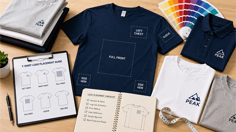
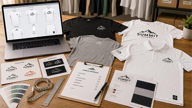
A digital mockup can look perfect while the finished shirt still feels wrong. This logo placement guide explains practical starting sizes for the left chest, center chest, front, back, sleeve, and hem. It also shows how TOMAS reviews garments, artwork, decoration methods, and samples so buyers can approve custom apparel with fewer surprises before bulk production.
Quick answer: There is no universal logo size or position for every shirt. Use the ranges below as starting points, then confirm the final artwork dimensions and measurement anchors on the actual garment, relevant size groups, and selected printing method.
Quick T-Shirt Logo Placement and Size Chart
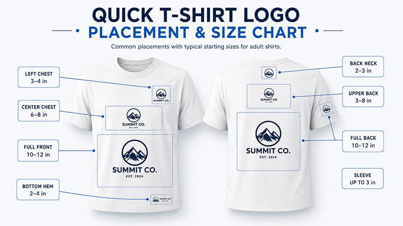
This placement T-shirt design size chart covers common adult starting ranges. The approved specification for a custom shirt should always take priority over a generic chart.
| Print location | Typical adult design size | Common starting position | Best applications | Common methods |
| Left chest | 3-4 in / 7.5-10 cm wide | Balanced below the collar and inside the chest panel | Uniforms, polos, staff shirts | Embroidery, screen printing, DTF |
| Center chest | 6-8 in / 15-20 cm wide | About 3-4 in / 7.5-10 cm below the front collar | Brand merchandise, promotional shirts | Screen printing, DTF, DTG |
| Full front | 10-12 in / 25-30 cm wide | About 3-4 in / 7.5-10 cm below the front collar | Events, campaigns, large graphics | Screen printing, DTF, DTG |
| Back neck | 2-3 in / 5-7.5 cm wide | Close below the rear collar | Secondary logos, retail branding | Screen printing, transfer, embroidery |
| Upper back | 3-8 in / 7.5-20 cm wide | Below the rear collar area | Staff roles, team names, short text | Screen printing, DTF, embroidery |
| Full back | 10-12 in / 25-30 cm wide | About 3-4 in / 7.5-10 cm below the rear collar | Teams, events, sponsor layouts | Screen printing, DTF, DTG |
| Sleeve | Usually up to 3 in / 7.5 cm wide | Centered in the usable sleeve panel | Sponsors, flags, departments | Transfer, screen printing, embroidery |
| Bottom hem | 2-4 in / 5-10 cm wide | Clear of the finished hem and side seam | Subtle branding, retail apparel | Screen printing, transfer, woven label |
The maximum print size is not automatically the best design size. A graphic can fit inside the technical print area but still look oversized, sit too low, or make a lightweight shirt uncomfortable. Always check the smallest garment, the largest important size, the artwork shape, and the worn appearance.
How to Choose a Logo Placement by Application
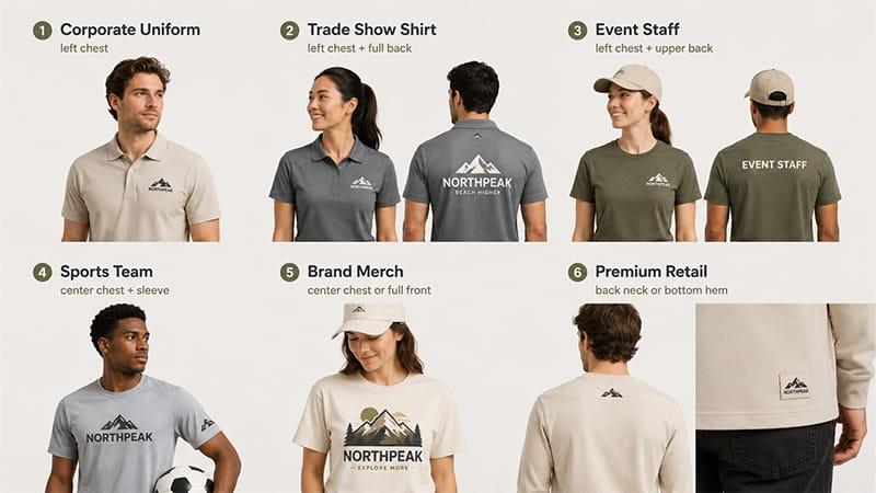
Choose the print location according to what the garment needs to communicate. A small left chest logo creates a restrained corporate look, while a center chest or full-front graphic makes a stronger brand statement. Garment construction, viewing distance, comfort, and repeat wear should influence the decision before the artwork is sized.
| Application | Recommended placement | Why it works | Approval focus |
| Corporate uniforms | Left chest | Professional and immediately visible | Logo clarity, pocket or placket balance |
| Trade show shirts | Left chest plus full back | Combines brand identity with long-distance visibility | Front-to-back hierarchy and staff readability |
| Event staff apparel | Left chest plus upper back | Makes the team easy to identify | Role text, viewing distance, size grouping |
| Sports team shirts | Center chest plus sleeve | Supports team identity and secondary logos | Movement, sleeve width, sponsor hierarchy |
| Brand merchandise | Center chest or full front | Gives the design more visual impact | Wearability, ink coverage, target audience |
| Premium retail apparel | Back neck or bottom hem | Provides subtle branding | Fine detail, seam clearance, repeat consistency |
Start with the purpose, not the available space. If the shirt needs to identify event staff, a small decorative logo may not be enough. If the shirt is a client gift, an oversized corporate logo may reduce the chance that people wear it again.
Top 8 T-Shirt Logo Placement Locations
Left Chest Logo Placement: The Corporate Standard
The left chest print is a classic choice for corporate logos, uniforms, hospitality teams, sales staff, and event crews. It keeps the brand immediately visible without using the entire front of the shirt. A common adult starting width is about 3-4 inches, but a wide wordmark and a circular badge will not look equally large at the same measurement.
For a reliable left chest placement, balance the left chest print against the collar, shoulder, sleeve, and any pocket or placket. Avoid measuring only from the armhole. As shirt size increases, the armhole moves outward and can push the logo too far toward the wearer’s side.
Record the finished artwork width and height, the measurement anchor, and whether the distance refers to the top or center of the design. For small embroidery, simplify thin lines and tiny text before sampling. A screen preview cannot prove that fine details will remain clear after digitizing and stitching.
Center Chest Logo Placement: A Modern Brand Presentation
A center chest logo works well for startups, lifestyle brands, clubs, promotional campaigns, and simple event merchandise. It is more noticeable than a left chest logo but usually more wearable than an oversized front design.
A practical adult starting width is about 6-8 inches, positioned roughly 3-4 inches below the front collar. Use the garment centerline as the primary reference, then check optical balance. An asymmetrical mark may need a small visual adjustment even when its artwork box is mathematically centered.
Crew necks, V-necks, and women’s fitted shirts do not offer the same chest area. A deep neckline may require a lower or narrower print, so review the selected shirt rather than applying one collar distance to every product.
Full-Front Logo Placement: Maximum Visibility
A full-front design suits campaign shirts, concerts, conferences, sports events, and branded merchandise. Adult graphics often start around 10-12 inches wide, subject to the garment and production equipment.
Before using the maximum exposure available, check the smallest shirt size and full artwork height. Large solid graphics can create a stiff hand feel and reduce breathability, particularly on lightweight fabric. Halftones, separated design elements, or a smaller print can preserve the bold statement while improving comfort.
For oversized designs, approve both a flat view and a worn sample. The design should clear the collar and hem, remain visually centered, and avoid folding around the body in a way that hides important text or brand names.
Full-Back Logo Placement: Event and Team Branding
The back provides a large print area for event names, sponsor lists, staff information, tour dates, team graphics, and campaign messages. A typical adult full-back design may begin 3-4 inches below the rear collar and measure about 10-12 inches wide.
The artwork proportions determine the final position. A tall sponsor list may need to start higher than a wide illustration, while a long graphic needs enough lower-hem clearance. Check the shirt while worn because shoulder width, body length, and fabric drape change how the design appears.
When a shirt uses front, back, and sleeve designs, approve each print location separately. Maintain a clear hierarchy between the main company logo, event identity, functional staff text, and secondary logos instead of making every mark the same size.
Upper Back and Back-Neck Placement
A small back-neck design supports subtle branding and usually measures about 2-3 inches wide. An upper-back design sits lower and can carry a team name, short event title, staff role, or secondary brand mark.
Keep both placements clear of the collar seam. Consider whether long hair, a raised collar, a hood, or a jacket will cover the artwork. Functional text such as STAFF or CREW should be sized for practical visibility, not treated like a small decorative logo.
Sleeve Logo Placement
Sleeves are useful for sponsor marks, flags, department names, event dates, and secondary branding. Many short-sleeve designs remain within about 3 inches wide, although the real placement size depends on the sleeve panel and garment size.
Curved surfaces and seams reduce the usable print area. Confirm the reading direction for vertical sleeve designs and check that the heat press, platen, or embroidery hoop can access the location. A sleeve design that looks correct while flat may face the wrong direction when the arm hangs naturally.
Side-Seam and Vertical Logo Placement
Side-seam and vertical designs are popular in fashion-led custom apparel and streetwear. They can feel distinctive, but they require more production planning than standard placements.
Confirm whether the garment has a true side seam, how much flat space is available, and whether the design will cross a fold or construction line. Standard screen-printing equipment may not support every wraparound concept. For artwork crossing garment panels, request a product-specific template and physical sample.
Bottom-Hem Logo Placement
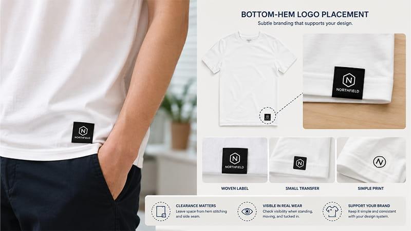
A bottom-hem mark provides subtle branding for retail shirts, premium gifts, and internal collection labels. It works best with a simple icon, short wordmark, woven label, or small transfer.
Leave enough clearance from the hem stitching and side seam. Check whether the mark remains visible during normal wear, including when the shirt is tucked in. This secondary placement should support the design system rather than add another production step with little audience value.
How to Measure T-Shirt Logo Placement
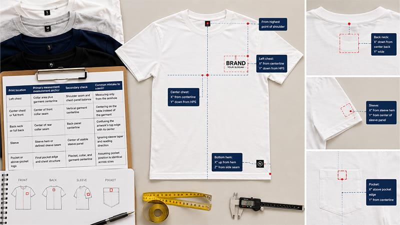
A useful measurement identifies the exact garment, the reference point, the part of the artwork being measured, and the applicable size group. Without those details, two operators can follow the same number and still place the design differently.
Step 1: Confirm the Final Garment and Representative Sizes
Measure the garment that will actually be decorated. Lay it flat without stretching, align the shoulder seams, and remove major wrinkles. For a wide size range, inspect at least one smaller and one larger representative size; the detailed size-group decision is covered in the apparel section below.
Step 2: Choose and Name the Measurement Anchor
The measurement anchor must match the print location. Do not mix a distance from the collar with a distance from the shoulder seam without stating which reference controls the placement.
| Print location | Primary measurement anchor | Secondary check | Common mistake to avoid |
| Left chest | Collar area plus garment centerline | Shoulder seam and chest-panel balance | Measuring only from the armhole |
| Center chest or full front | Center of front collar seam | Vertical garment centerline | Centering on the table instead of the garment |
| Back neck or full back | Center of rear collar seam | Back-panel centerline | Confusing the artwork’s top edge with its center |
| Sleeve | Sleeve hem or defined sleeve seam | Center of usable sleeve panel | Ignoring sleeve taper and reading direction |
| Pocket or above-pocket logo | Final pocket edge and chest structure | Placket, collar, and garment centerline | Assuming pocket position is identical across sizes |
Step 3: Define Which Part of the Artwork the Number Locates
State whether the measurement ends at the artwork’s top edge, center point, or another defined point. For example, “3.5 inches below the collar” is incomplete unless the specification explains what that distance locates.
Record both finished width and height. A tall logo can sit differently from a horizontal wordmark at the same width. Keep the artwork ratio locked unless a separate version has been approved.
Step 4: Check Optical Balance on the Garment
Check how the measured position relates to the neckline, shoulder, sleeve, pocket, and body centerline. Asymmetrical artwork may need a small optical adjustment even when its file box is mathematically centered.
Review the design on a person, dress form, or properly filled garment when possible. A flat shirt cannot show fabric drape, body shape, or how a large design wraps when worn.
Step 5: Save One Approved Production Reference
Record the garment model, applicable sizes, artwork revision, finished dimensions, measurement anchor, decoration method, and approved position. Keep this specification with a marked photograph and the approved sample so production and future reorders use the same reference.
How Logo Placement Changes Across Apparel Types
The same logo placement does not transfer unchanged between all T-shirts and garments. Construction details determine the usable surface area and the correct measurement anchor.
| Apparel type | Recommended locations | Key consideration |
| Crew-neck T-shirts | Front, back, sleeve | Collar distance and print area |
| V-neck T-shirts | Left chest, lower center chest | Reduced vertical chest space |
| Polo shirts | Left chest, sleeve | Placket, buttons, pocket, embroidery access |
| Pocket T-shirts | Pocket, above pocket, opposite chest | Pocket position and usable function |
| Hoodies | Chest, sleeve, back | Pouch pocket, zipper, hood coverage |
| Jackets | Chest, sleeve, back | Panels, lining, waterproof layers, seam structure |
Polo Shirts and Pocketed Garments
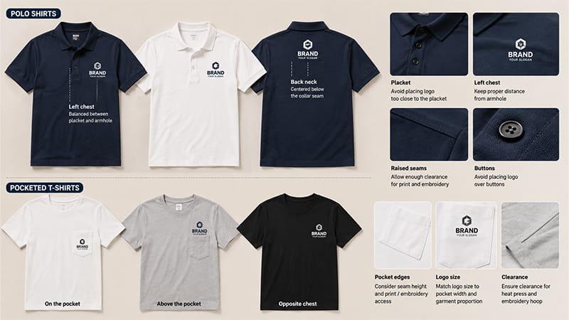
Polo shirts need separate T-shirt design placement decisions because the placket and buttons change the visual center. A left chest print should be balanced between the placket and armhole, not copied from a crew-neck template. On a pocketed polo, the logo may sit on the pocket, above it, or on the opposite chest.
Raised seams, buttons, and pocket edges can interfere with print pressure, heat-press contact, and embroidery access. There is no universal seam buffer for every garment; suitable clearance depends on logo size, fabric, construction, decoration method, and equipment.
One Artwork Size or Multiple Size Groups?
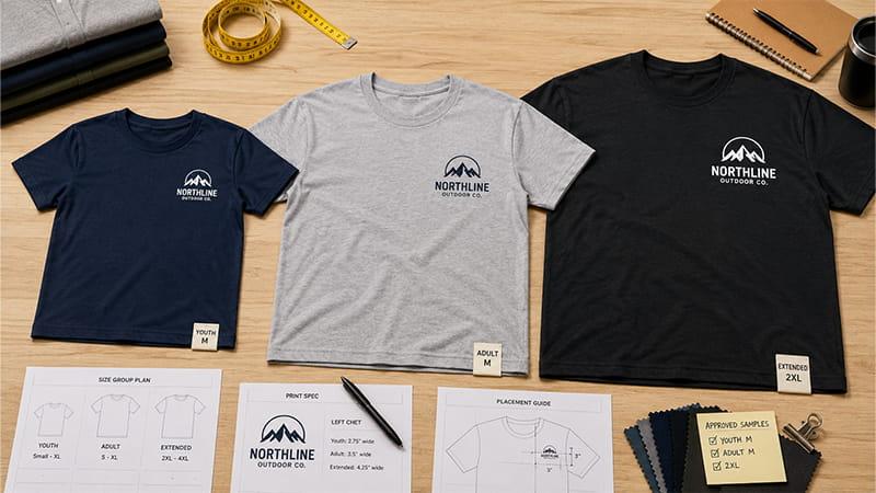
One fixed logo size can work across a limited adult range, especially for a small left chest logo. A large graphic is more likely to need size grouping because it occupies a greater proportion of the shirt.
Youth, fitted, and extended sizes may need separate artwork groups. Reducing an adult design proportionally can make text too small on youth apparel. On large garments, using only the armhole as a reference can push the left chest logo too far outward.
For mixed-size bulk orders, review representative garments from the main shirt size groups. Record which artwork version applies to each group rather than leaving scaling decisions to the production operator.
For more garment planning guidance, see TOMAS Crafts’ custom T-shirt design guide and shirt neckline guide.
How Printing Methods Affect Logo Placement
Choose the printing method before approving the final design placement. Every method has different requirements for flat space, detail, fabric stability, heat, pressure, and equipment access.
Embroidery Logo Placement
Embroidery is commonly used for polos, uniforms, jackets, hats, sleeves, and left chest logos. It creates a durable, dimensional finish, but very small text, thin lines, and dense designs may not sew cleanly.
The finished result depends on digitizing, stitch density, backing, fabric stability, and hoop access. Lightweight performance fabric may pucker under a dense design. Approve an actual embroidered sample when clarity, fabric behavior, or brand presentation matters.
Screen Printing
Screen printing works well for full-front, full-back, and repeated multi-color designs. It normally requires a stable, relatively flat surface with enough clearance from thick seams, zippers, pockets, and plackets.
Large graphics need an ink-coverage and comfort review. Heavy solid areas can change the hand feel and reduce breathability on lightweight shirts. Depending on the fabric and project, possible solutions include reducing solid areas, using halftones, separating design elements, or selecting a compatible softer-hand ink system. Confirm the artwork, ink system, garment color, and wash expectations during sampling.
DTF, DTG, and Heat Transfer
DTF and heat transfer are flexible options for detailed artwork, names, small production runs, and multiple colors. The heat press still needs even contact, so raised structures can create pressure problems. With DTG, pretreatment, fabric composition, and shirt color affect the result.
The best method depends on the artwork, quantity, fabric, color count, required durability, budget, and timeline. Compare the practical tradeoffs in TOMAS Crafts’ guide to eight types of T-shirt printing.
Three Checks TOMAS Makes Before Sampling
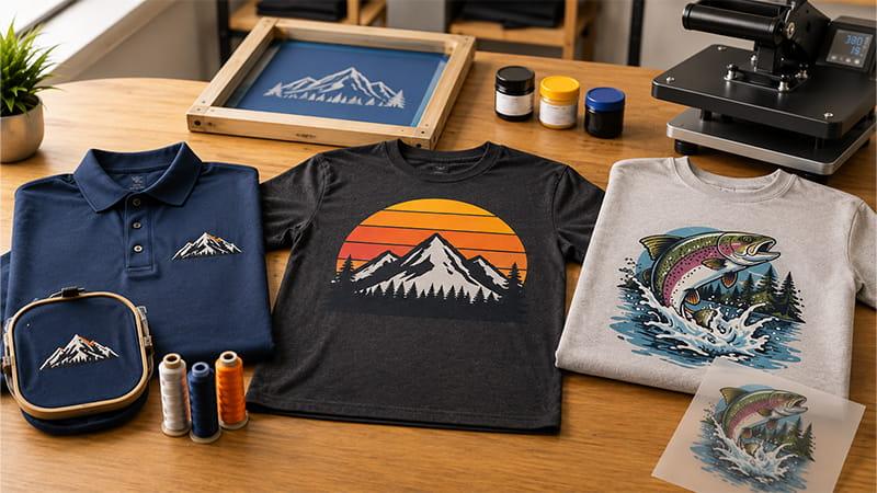
1. Worn position: A design centered by dividing the flat shirt length can land too low on the torso. TOMAS starts chest placement from the collar seam and garment centerline, then checks the selected garment on a person or representative form to prevent a belly-print result.
2. Equipment access: Armholes, collar ribs, plackets, pockets, zippers, and thick seams can interrupt print pressure or embroidery hooping. TOMAS checks the actual garment structure and selected equipment instead of applying one universal clearance number.
3. Decoration result: Fine embroidery, large solid prints, and heat-applied graphics create different risks. The sample is reviewed for clarity, edge quality, fabric distortion, hand feel, and comfort before the placement is approved for bulk production.
What TOMAS Checked in a Multi-Garment Enquiry
An Australian uniform buyer asked TOMAS to review a coordinated range of polos, T-shirts, hoodies, caps, and aprons. The enquiry included combed-cotton apparel, relatively low minimum quantities, and embroidery, screen printing, DTG, and DTF options.
The placement risk was applying one logo size to every item. A balanced polo logo could be too wide for an apron bib, too small on a hoodie, or unsuitable for the available cap embroidery area.
TOMAS proposed one shared brand system for color, hierarchy, and artwork versions, supported by a separate specification for each garment family. Each sheet would define the finished dimensions, location, measurement anchor, and decoration method.
This was an enquiry and specification exercise, not a completed-order result. The practical lesson is that brand consistency comes from controlled specifications, not identical logo dimensions on every product.
Custom T-Shirt Logo Placement Checklist
Before sampling or bulk production, confirm these ten points:
· Final garment style, fabric, color, and product link
· Quantity by size and any required artwork size groups
· Intended use, destination country, and required delivery date
· Final vector or suitable high-resolution artwork version
· Fonts converted to outlines and an editable master file retained
· Finished width, height, location, and measurement anchor for each design
· Approved color reference when color is critical
· Decoration method and garment-structure clearance confirmed
· Representative garment sizes and physical sample checked where required
· Approved sample, specification, and reference photographs retained for inspection and reorders
Adobe explains why vector artwork can scale without losing quality. Retain an editable master file. A Pantone reference also gives buyers and suppliers a clearer shared color target than a screen preview alone.
For garments with shrinkage risk or strict retail requirements, consider a decorated wash sample. A recognized procedure such as AATCC TM150 may be appropriate when formal dimensional-change testing is required.
TOMAS Placement Specification Sheet
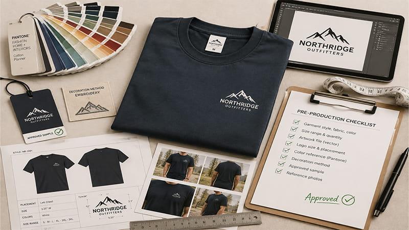
Use the printable worksheet to record the information needed for artwork review, sampling, bulk inspection, and future reorders.
| Specification | Required approval |
| Garment style | Crew neck, V-neck, polo, hoodie, pocket shirt, or another final style |
| Fabric and color | Final material and color specification |
| Size range | Quantity by size and any grouped artwork sizes |
| Decoration location | Front, back, sleeve, hem, or multiple locations |
| Finished artwork size | Approved width and height |
| Measurement anchor | Collar, centerline, pocket, placket, sleeve hem, or template point |
| Decoration method | Screen print, DTF, DTG, transfer, embroidery, or another approved method |
| Artwork version | Final file name and revision |
| Approval references | Digital mockup, physical sample, and marked photographs |
| Bulk reference | Approved sample and final measurement sheet |
Final Takeaway: Approve the Garment, Artwork, and Placement Together
Use this logo placement guide to choose a practical starting location and size, not as a universal production template. Final placement should reflect the actual garment, logo shape, size range, decoration method, and viewing purpose.
For bulk custom apparel, the strongest production reference combines approved artwork, finished dimensions, a clear measurement anchor, representative samples, and reference photographs. This gives buyers and production teams the same standard for inspection and future reorders.
Need a Logo Placement Review Before Sampling?
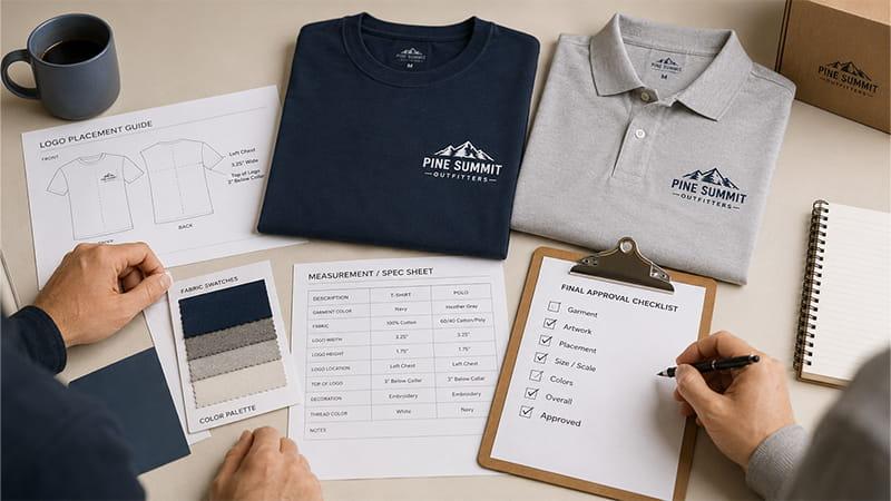
Send TOMAS your garment style, logo file, size quantities, destination, and delivery date. TOMAS can review the available print area, identify placement risks, and recommend suitable artwork sizes, decoration methods, and sample checks before bulk production.
Explore TOMAS custom apparel or request a logo placement review.
FAQs
What is the best logo placement on a T-shirt?
The best placement depends on the purpose. A left chest logo suits corporate uniforms, a center chest design suits merchandise, and front-plus-back branding works well for events. Choose the location based on visibility, garment construction, and how the audience will wear the shirt.
What is the standard left chest logo placement?
A common adult starting point is about 3-4 inches below the collar, with the logo measuring approximately 3-4 inches wide. Balance it between the garment centerline and sleeve. Do not rely only on the armhole as an anchor because its position changes across shirt sizes. Confirm the final placement on the selected garment.
What size should a logo be on a shirt?
Typical adult starting widths are 3-4 inches for left chest and 6-8 inches for center chest, while full-front or full-back graphics often start at 10-12 inches and many sleeve designs stay within about 3 inches. These are planning ranges, not universal production rules.
Why does my T-shirt logo look too low?
The design may have been centered on the flat shirt instead of positioned from the collar and visual chest area, creating a belly-print effect. Use a collar-based starting measurement, check the garment centerline, and approve the appearance while the shirt is worn.