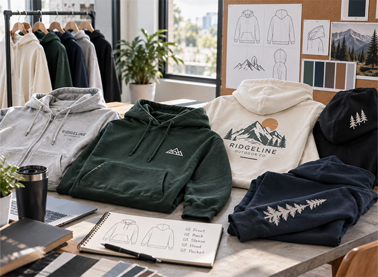
If you are ordering custom hoodies and already have the artwork, logo placement is often one of the final artwork decisions to confirm before sampling or production. The challenge is that a position that works on one hoodie may not work the same way on a zip-up, oversized fit, or style with a large kangaroo pocket. This guide will help you choose the placement, size, and checks that matter before you approve the design.
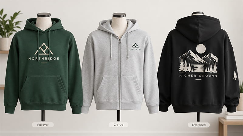
Start With the Hoodie Style Before Choosing the Logo Position
Before measuring anything, look at the hoodie construction. The same logo can sit comfortably on one style and feel crowded, broken, or undersized on another.
The hood, zipper, drawstrings, kangaroo pocket, shoulder shape, and overall fit all change the usable decoration area. Choosing the hoodie first makes the placement decision much easier.
Pullover Hoodies Give You More Freedom on the Front
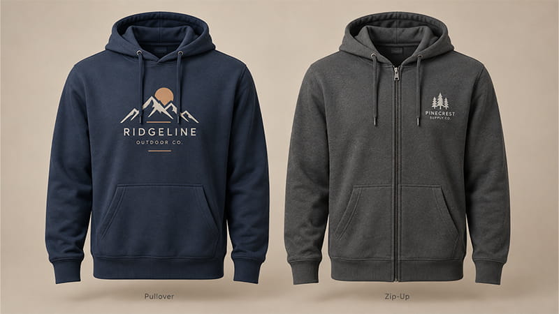
Pullover styles provide one continuous front panel, so center-chest logos and larger graphics are relatively easy to position. Horizontal artwork can run across the chest without a zipper interrupting the middle of the design.
The kangaroo pocket remains the main restriction. Its height and shape can vary between hoodie patterns, which means artwork that sits comfortably on one style may feel too close to the pocket on another.
Tall or square graphics deserve extra attention here. Judging the artwork only by width can leave the lower edge much closer to the pocket than expected once the full design is applied.
Zip-Up Hoodies Need a Different Front Layout
On a zip-up hoodie, the zipper changes the front immediately. Any artwork crossing the center line is divided into two panels, and that break becomes even more noticeable when the hoodie is worn open.
Before approving a center-front design, open the zipper and see whether the artwork still makes sense. If half the company name falls on each side or an important symbol is split through the middle, the layout probably needs another approach.
One-side chest branding, sleeve artwork, or a larger back graphic is often easier to control. When the same project includes both pullovers and zip-ups, two placement versions of the branding may look cleaner than forcing one front layout onto both garments.
Regular-Fit and Oversized Hoodies Should Be Checked Separately
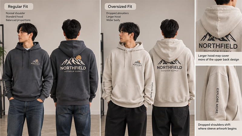
Oversized hoodies change more than garment width. Dropped shoulders shift where sleeve artwork begins, a larger hood may cover more of the upper back, and a wider body changes the visual proportion of larger front and back graphics.
Small chest branding can often stay at the same physical size across regular and oversized fits. The bigger concern is whether the placement still relates naturally to the garment construction once shoulder seams, hood coverage, and body proportions change.
Sleeve graphics, upper-back artwork, and large front or full-back designs therefore deserve another check on the actual oversized hoodie rather than simply copying the placement used on a regular fit.
Where Can You Place a Logo on a Hoodie?
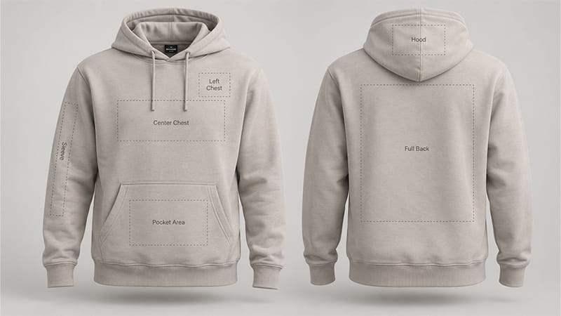
Most hoodie designs use the chest, front, back, sleeve, hood, or pocket area. The right choice depends on what the artwork needs to do: identify a company, carry the main visual, support an event design, or add a smaller secondary detail.
| Placement | Works Well For | Main Thing to Check |
|---|---|---|
| Left or right chest | Company logos, crests, embroidery | Zipper, armhole and logo proportion |
| Center chest | Main logo, wordmark or medium graphic | Drawstrings and pocket spacing |
| Large front | Merchandise, campaigns, event artwork | Artwork height, zipper and pocket |
| Upper back | Small logo or short text | Hood coverage |
| Full back | Large graphics, teams and events | Hood covering the upper design |
| Sleeve | Sponsors, dates and secondary branding | Orientation when worn |
| Hood | Small supporting detail | Folds and movement |
| Pocket area | Small logo, patch or accent | Seams and pocket openings |
These positions may sound similar to T-shirt placement, but the garment structures are different. If your project includes tees or polos as well, our T-shirt logo placement guide covers those garments separately.
Front Logo Placement on a Hoodie
Look at a hoodie mockup and the front can seem like one large printable rectangle. In practice, the clean design area sits between several fixed garment features.
The neckline and drawstrings affect the top, the kangaroo pocket affects the bottom, and a zipper may divide the middle. Total chest width is not the same as usable design space.
Left-Chest and Right-Chest Logo Placement
For company apparel, schools, teams, and staff programs, a small chest logo is one of the easiest placements to wear regularly. It keeps the branding visible without making the whole front feel like an advertisement.
Chest placement also works naturally on zip-up hoodies because the artwork can remain completely on one side of the zipper. What matters most is keeping the mark visually connected to the chest rather than pushing it too close to the center or too far toward the armhole.
Logo shape makes a noticeable difference. A long wordmark, round emblem, and square badge may all need different dimensions even though each one is technically a left-chest logo.
Center-Chest Logo Placement
Center chest gives the artwork more visual importance and works well for a main brand mark, short message, university name, or medium-sized graphic. Pullovers are particularly suited to this position because nothing interrupts the middle of the garment.
Watch the vertical placement carefully. Move the design too high and drawstrings may repeatedly cross the artwork; too low, and the graphic starts to feel pressed against the kangaroo pocket.
Instead of centering by measurement alone, look at the space above and below the design. The logo should feel centered within the usable chest area, not simply within the mathematical center of the front panel.
Large Front Graphics
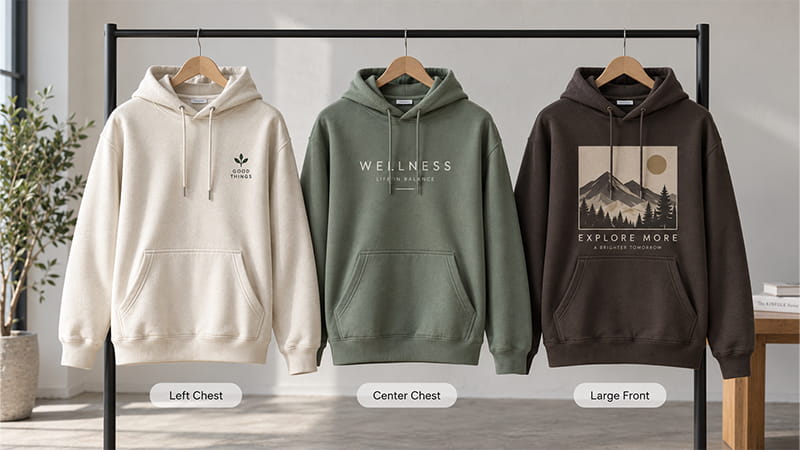
Large graphics are where hoodie construction becomes much more noticeable. Increasing the width often increases the height too, which quickly reduces the breathing room between the neckline and the pocket.
This is one of the easiest details to underestimate on a digital mockup. The front of a hoodie usually has less clean design space than it appears to have on screen, especially with square and vertical artwork.
Before approving a large graphic, check its lower edge on the selected hoodie. If there is barely any room left above the kangaroo pocket, reducing or restructuring the artwork will usually look better than filling the maximum technical decoration area.
Back Logo Placement on a Hoodie
For artwork that needs more room, the back is usually the easiest place to work with. Team graphics, event designs, campaigns, merchandise, and larger illustrations all benefit from the extra space.
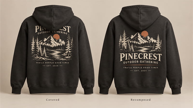
The hood takes some of that space away again. Once it falls naturally against the back, the upper part of the artwork may no longer be visible.
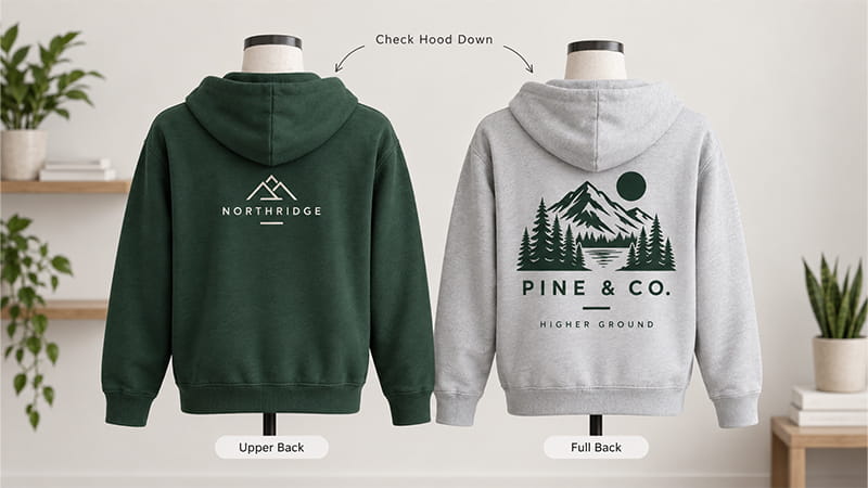
Upper-Back Logo Placement
Upper-back placement works best for compact artwork: a short brand name, small secondary logo, event name, or simple line of text.
Problems start when the design moves too close to the neckline. The position may look perfectly reasonable while the hoodie is flat, then disappear almost completely once the hood drops.
Instead of asking only how many inches the logo sits below the collar, ask a more useful question: what can people still see when the hood is down?
Full-Back Logo Placement
Full-back artwork gives large designs room to breathe and keeps the graphic visible from a distance. Sports teams, events, branded merchandise, tours, and campaigns often make good use of this position.
The upper part of the composition deserves more attention than buyers sometimes expect. If the brand name, event title, or first line of important text sits directly underneath the hood, the most valuable information may be the first thing to disappear.
Moving the entire design lower is not always the best fix. Rearranging the composition so less important artwork occupies the upper area can preserve the message without making the whole graphic look unusually low.
Check the Back Design With the Hood Down
This is one of the simplest checks in custom hoodie production: put the hood down and look at the artwork again.
Back artwork can appear perfectly balanced while the hoodie is flat, then lose its headline, brand name, or upper illustration once the hood rests naturally on the garment. STAHLS also advises decorators to account for the portion of the back covered by the hood when positioning full-back hoodie graphics. See the STAHLS hoodie heat-printing guide.
Measurements still matter for production consistency, but they should not override what the hoodie actually looks like in use.
Sleeve, Hood, and Pocket Logo Placement
Secondary placements can make a hoodie feel more considered without adding another large graphic to the front or back. Sleeves, hoods, and pockets work especially well for dates, sponsor marks, initials, department names, or smaller brand details.
Movement makes these areas less predictable than the body of the hoodie. Simple artwork usually handles that movement better than fine text or intricate graphics.
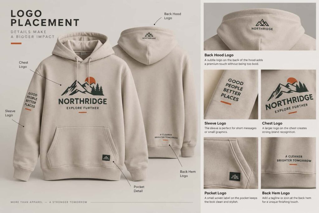
Sleeve Logo Placement
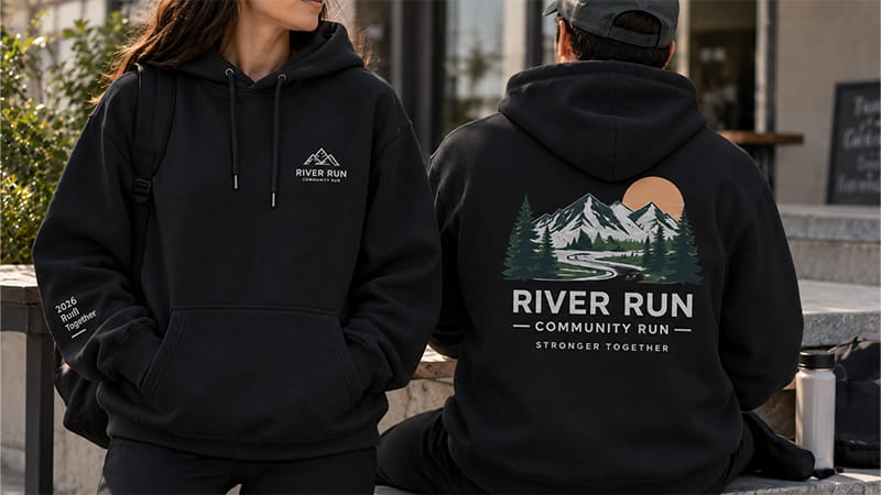
Sleeves are useful when the chest or back already carries the main design. Sponsor marks, event dates, department names, small icons, and short text can sit here without competing for the same visual space.
Remember that the sleeve wraps around the arm. Artwork that looks centered while flat may rotate toward the front or back once the wearer lets their arm hang naturally.
When reading direction matters, check a worn sample rather than relying only on a seam or flat-sleeve measurement.
Hood Logo Placement
The hood can carry a small logo on the side, rear center, or near an edge, but it is one of the least stable areas of the garment. Its shape changes whenever it is folded, worn, or resting on the back.
That makes fine lettering and detailed graphics harder to control. If the brand name needs to remain consistently visible, the chest, back, or sleeve is usually a more predictable choice.
Used as a subtle detail, however, a simple hood mark can add identity without competing with the main graphic.
Pocket-Area Logo Placement
The kangaroo pocket can support a small mark, patch, or accent, but it should not be treated as another flat rectangular panel. Pocket openings, seams, folds, and regular hand movement all affect the surface.
Designs that work with those features usually look more intentional than artwork stretched across them. Keep important text away from areas where the pocket naturally bends or opens.
How Big Should a Hoodie Logo Be?
Logo-size charts are useful when creating the first mockup, but they should be treated as starting references rather than fixed production standards.
There is no single hoodie logo size that works for every blank or every piece of artwork. A placement reference can establish the initial scale, but artwork proportions, garment size, fit, hood construction, and the available decoration area still affect the final dimensions.
As one industry reference, the STAHLS Ultimate Guide to Design Size & Placement provides the following adult design-size references. These figures are useful for comparison, not as universal specifications for every hoodie.
| Placement | STAHLS Adult Reference Size |
|---|---|
| Left chest | 3.5 × 3.5 in |
| Front centered — non-zip / pullover | 11 × 11 in |
| Back centered | 14 × 11.25 in |
| Long sleeve design | 2 × 11.5 in |
STAHLS lists the 11 × 11 in front-centered reference for non-zip garments. A zip-up hoodie needs a separate front layout because the zipper interrupts the design area.
The biggest takeaway is not the exact number. Different placement areas need different proportions, and the selected hoodie still needs to be checked before final approval.
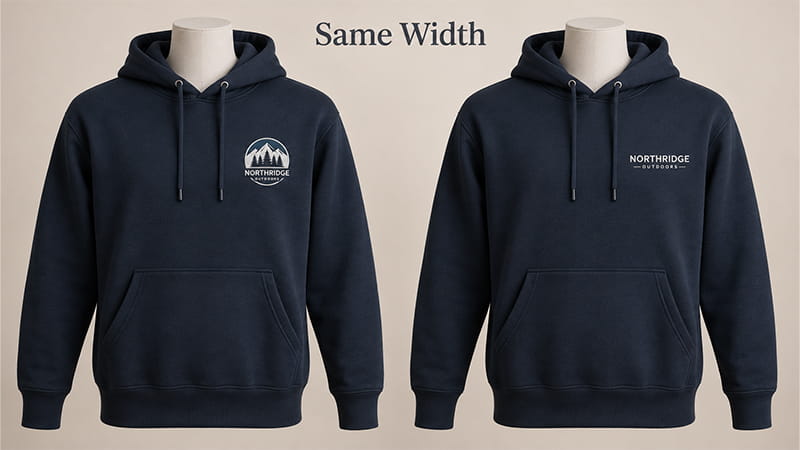
Small Chest Logos
With smaller logos, readability matters more than filling the available space. Simple icons can stay clear at a compact size, while a long company name, tagline, or detailed crest may need more width.
Consider two logos that are both 8 cm wide. An 8 × 8 cm circular badge occupies much more fabric than an 8 × 2 cm wordmark, even though the width is identical.
That is why logo width alone does not tell you how large the design will look. Review the complete artwork dimensions and visual weight before approval.
Center-Chest and Full-Front Designs
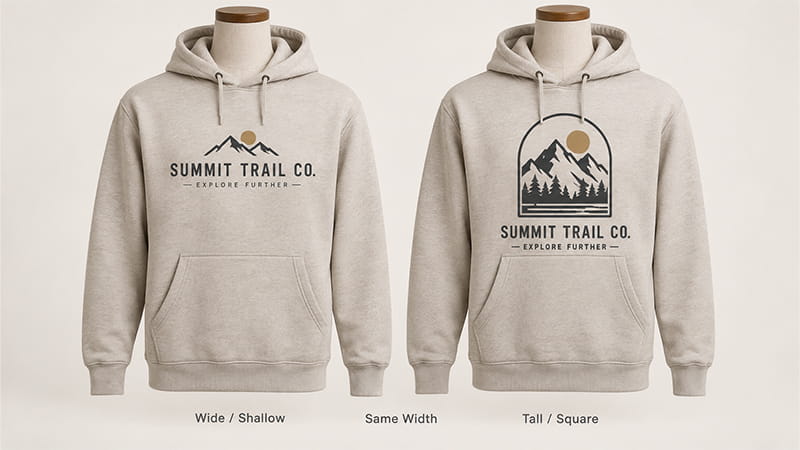
Width tells only part of the story for larger artwork. A wide, shallow wordmark may fit comfortably, while a square design at exactly the same width can extend much closer to the pocket.
Artwork height therefore deserves the same attention as width. The complete shape should be checked against the clean front area of the hoodie.
Large designs also need more review across a broad garment size range because the available space can change substantially between the smallest and largest pieces in an order.
Full-Back Logo Size
Back designs allow more scale, but hood coverage still affects the upper part of the artwork. Look at where the key text, logo, and illustration sit instead of focusing only on total width.
For tall designs, revising the composition can sometimes work better than shifting the complete graphic downward.
Keeping the main message below the hood while allowing less important visual details to extend upward often produces a more natural result.
Should Logo Size Change Across Hoodie Sizes?
Not necessarily. Small chest branding can often remain one physical size across several adult hoodie sizes without looking unusual.
Large front and back designs deserve more attention because the difference becomes easier to notice between a small hoodie and a 3XL or oversized style. Reviewing a smaller size, a common middle size, and one of the largest sizes will usually show whether size grouping is needed. If the order also includes women’s or youth hoodies, check those separately.
The goal is not to create a different artwork file for every garment. It is to catch obvious proportion problems before bulk production begins.
Does the Decoration Method Affect Hoodie Logo Placement?
Enough physical space does not automatically make a placement suitable for every decoration process.
Embroidery, screen printing, DTF, and DTG handle small details, solid areas, fabric texture, and artwork scale differently. If you are still comparing methods, our guide to T-shirt printing methods explains the main differences in more detail.
Embroidery
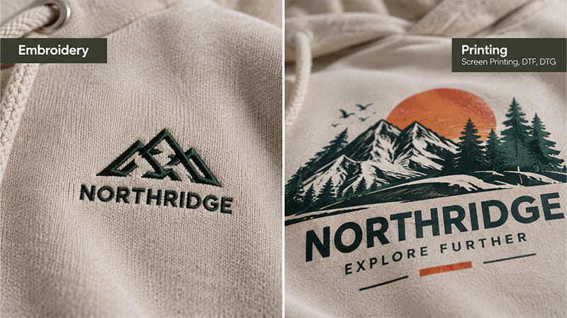
Small chest logos, sleeve marks, patches, and compact secondary branding are natural candidates for embroidery. The stitched surface adds depth and often works particularly well with simple corporate, school, and team logos.
Fine text is where problems become more noticeable. Thin outlines, tiny gaps, and tightly spaced elements may lose clarity once the artwork is converted into stitches.
Large embroidered areas behave differently from large prints too. Dense stitching can make the decorated area firmer and visually heavier, so approve the stitched result rather than judging the digital file alone.
Screen Printing, DTF, and DTG
Printing gives larger graphics more flexibility and is often easier to use for multicolor artwork, full-back designs, illustrations, gradients, and finer detail.
The hoodie fabric still affects the result. Surface texture, fiber content, garment color, artwork coverage, and the selected process can all influence how the print looks and feels.
Very fine details can also become harder to reproduce on textured fleece, depending on the artwork and printing process.
This is why the printing method should be selected after the hoodie and artwork are understood, rather than treating screen printing, DTF, or DTG as the first decision.
Choose the Placement Before Forcing the Decoration Method
A practical sequence is hoodie style → placement → artwork → fabric → decoration method.
Detailed full-back artwork may suit printing better than a large field of dense embroidery. A small, simple chest mark may point in the opposite direction and work naturally in thread.
The process should support what the design is trying to achieve on the garment rather than force the artwork into a method simply because it was chosen first.
How to Use More Than One Logo Placement Without Making the Hoodie Look Busy
Companies, schools, teams, events, and sponsored programs often need branding in more than one location. Multiple placements can work well when each one has a clear job.
The back might carry the main event or team artwork, the chest a smaller organization mark, and the sleeve a sponsor or date. Clear hierarchy matters more than making every logo equally visible.
Before adding another position, ask what it contributes. If the only reason for another large mark is “more exposure,” it may make the hoodie feel more like advertising. Let one placement lead and use the others to support it.
What to Check Before Approving a Custom Hoodie for Production
Digital proofs are useful for confirming artwork direction, but they cannot show everything that happens once the hoodie becomes a three-dimensional garment.
Before production, use the selected garment or sample to check:
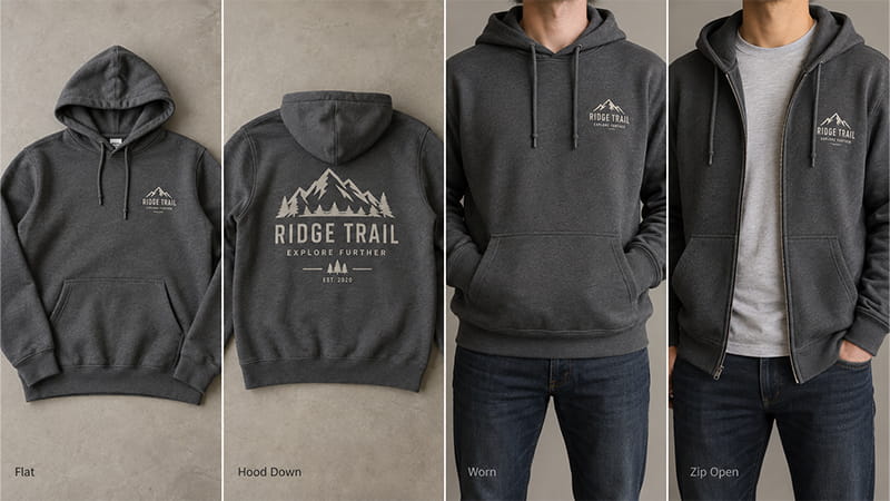
- Flat position: logo size, centering, neckline, seams, zipper, and pocket clearance.
- Hood down: whether important back artwork stays visible.
- Hoodie worn: chest balance, sleeve direction, large front graphics, and oversized proportions.
- Pullover and zip-up separately: whether the same artwork still works on both constructions.
- Finished decoration: whether the actual embroidery or print still looks like the approved design.
These checks become particularly useful when the artwork is unusually tall or wide, the size range is broad, or the project uses several decoration locations.
Record More Than “Left Chest”
“Left chest” tells production the general area, but it does not fully describe the finished placement. A useful reference also records the artwork width and height, the measurement point, the garment style, and any applicable size grouping.
The same applies to phrases such as “10 cm logo.” Without stating whether 10 cm refers to the width or height, different people can interpret the same instruction differently.
A repeatable placement needs a clear reference, not just a position name. This becomes particularly useful for repeat orders, where the goal is to reproduce the approved result rather than rebuild the placement from memory.
Approve the Finished Decoration, Not Just the Position
Correct placement does not guarantee a good-looking result. Once printing or embroidery is applied, the visual weight and behavior of the artwork can change.
Embroidery makes this particularly easy to see. Small text may lose definition, dense stitching can make the fabric firmer, and the finished mark can appear heavier than it did on screen.
Final approval should therefore cover both where the logo sits and how the decoration actually behaves on the hoodie.
Common Hoodie Logo Placement Mistakes
Most placement problems are easier to correct during artwork approval or sampling than after the hoodies have already been decorated.
- Important back artwork hidden by the hood: a small amount of overlap may be fine, but key text, logos, or the main part of the design should not disappear when the hood rests naturally on the back.
- Center-front artwork reused on a zip-up without adjustment: a design that works on a pullover may be split awkwardly by the zipper or stop making sense when the hoodie is worn open.
- Front artwork crowded between the drawstrings and pocket: the issue is not simply that the design is large, but that there is too little breathing room around it.
- Important text placed where the drawstrings naturally fall: moving drawstrings can cover wording or small details that need to stay readable.
- Oversized styles approved without a separate proportion check: the same logo may still work, but the wider body, dropped shoulders, and larger hood can change how the placement feels.
- Sleeve artwork approved only while the garment is flat: the design may rotate toward the front or back once the arm hangs naturally, especially when text has a clear reading direction.
- Several logo positions used without a clear hierarchy: chest, back, and sleeve branding can work together, but the hoodie becomes visually busy when every placement is treated as the main focal point.
The common thread is not that one particular placement is always wrong. Problems usually appear when the artwork is approved without checking how the selected hoodie actually changes the design.
Hoodie Logo Placement FAQs
Where Should a Logo Go on a Hoodie?
The best position depends on what the logo needs to do. Left chest suits subtle company, team, or school branding, while center chest gives the main logo more presence.
Full-back artwork works well when the design needs more room or stronger visibility. Sleeves, hoods, and pocket areas are usually better as supporting placements rather than the only place important branding appears.
Whichever position you choose, check how the hood, zipper, drawstrings, pocket, artwork shape, and fit interact with the design.
What Size Should a Logo Be on a Hoodie?
There is no single standard hoodie logo size. Small chest logos, centered front graphics, back artwork, and sleeve designs all use very different proportions.
Use a placement chart to establish the first mockup, then check the artwork on the selected garment. Artwork shape and usable garment space matter more than following one measurement mechanically.
Where Should a Logo Go on a Zip-Up Hoodie?
Left chest, right chest, sleeve, and back placements are usually easier to manage because they keep important artwork away from the center zipper.
If the design needs to cross the zipper, build it intentionally around that split. Check the hoodie both open and closed before approving the layout.
How Far Below the Neckline Should a Hoodie Logo Be?
No single distance works for every hoodie. Neckline shape, hood construction, drawstrings, artwork height, pocket location, and overall fit all affect the visual position.
Placement guides can provide a useful starting point, but adjustments may still be needed for the garment style, size, artwork, and construction.
Is Embroidery Better Than Printing for Hoodie Logos?
Neither method is automatically better. Embroidery works well for many small, simple logos, while printing gives larger, colorful, and highly detailed artwork more flexibility.
The better choice depends on the artwork, logo placement, fabric, desired finish, quantity, and how the hoodie will be used.
Make the Final Decision on the Actual Hoodie
Logo placement is easiest to judge when you stop looking at the artwork as a flat file and start looking at the hoodie as a finished garment. The hood, zipper, pocket, fit, and decoration method all change how the design is seen once the hoodie is worn.
A placement chart can help you get started, but the final approval should come from how the design looks on the selected hoodie. If the logo feels balanced, stays visible, and works naturally with the garment construction, you are much closer to a result that will hold up in production.
Need Help With Your Custom Hoodie Project?
TOMASCRAFTS supports businesses, schools, event organizers, sports teams, brands, and promotional product distributors with one-stop custom merchandise sourcing. Along with custom hoodies, we can coordinate matching apparel, caps, bags, drinkware, packaging, and other promotional items within the same project, helping buyers avoid managing multiple suppliers separately.
Whether you are ordering hoodies on their own or building a complete employee, event, team, or merchandise program, we can help coordinate product sourcing, customization, packaging, and shipment based on your project requirements.
Contact TOMASCRAFTS to discuss your project and request a quotation.